
DI Bar Charts Data Interpretation
Bar charts like Line graphs are graphical representation of data which is easy to comprehend as they are visually displayed unlike Tables.
DI Bar Charts Data Interpretation Shortcut video:
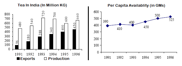
Study the following graph and answer questions
There are 10 questions based on the graph below to help you understand and comprehend different types of questions in Bar charts.
1. Which year shows the maximum percentage of export with respect to production?
(1)1992
(2)1993
(3)1996
(4)1995
2. The population of India in 1993 was
(1)800 million
(2)1080 million
(3)985 million
(4)900 million
3. If the area under tea production was less by 10% in 1994 than in 1993, then the approximate rate of increase in productivity of tea in 1994 was
(1)97.22
(2)3
(3)35
(4)None of the above
4. The average proportion of tea exported to the tea produced over the period is
(1)0.87
(2)0.47
(3)0.48
(4)0.66
5. What is the first half-decades average per capita availability of tea?
(1)457 gm
(2)535 gm
(3)446 gm
(4)430 gm
6. In which year was the per capita availability of tea minimum?
(1)1996
(2)1994
(3)1991
(4)None of these
7. In which year was there minimum percentage of export with respect to production?
(1)1991
(2)1992
(3)1993
(4)1994
8. In which year we had maximum quantity of tea for domestic consumption?
(1)1994
(2)1991
(3)1993
(4)1996
9. What approximately was the average quantity of tea available for domestic consumption during the period?
(1)324.3 million kg
(2)400 million kg
(3)410.3 million kg
(4)320.3 million kg
10. What was approximately the average population during the period?
(1)625 million
(2)624 million
(3)600 million
(4)757 million
ANSWERS:
1(3)
2 (2)
3 (4)
4 (2)
5 (4)
6 (3)
7 (1)
8 (3)
9 (1)
10 (4)
