Let’s Crack CAT 2026

Your CAT check-up · tap a ring to see yours

CAT 2026Papers & G StrategyGraphs & Tables

CAT Graphs & Tables questions (2017–2025) — actual DILR sets with solutions

116 real CAT Graphs & Tables questions from CAT 2017 to CAT 2025, each with options, the verified answer and a step-by-step solution. Practice one topic at a ti

116 real CAT questions · CAT 2017–2025 · 9 Easy · 3 Medium

Q1CAT 2025 · Slot 2 · CAT Easy · TITA✓ Answer verified

Sustainability Index Scatter Graph

The Sustainability Index (SI) of a country at a point in time is an integer between 1 and 100. This question is related to SI of six countries – A, B, C, D, E, and F – at three different points in time – 2016, 2020, and 2024. The plot represents the exact changes in their SI, with X-coordinate representing % increase in 2020 from 2016, i.e., (SI in 2020 minus SI in 2016) / (SI in 2016), and Y-coordinate representing % increase in 2024 from 2020. At any point in time, the country with highest SI is ranked 1, while the country with the lowest SI is ranked 6. The following additional facts are known. 1. In 2016, B, C, E, and A had ranks 1, 2, 3, and 4 respectively. 2. F had lower SI than any other country in 2016, 2020, and 2024. 3. In 2024, E was the only country with SI of 90. 4. The range of SI of the six countries was 60 in 2016 as well as in 2024.
Figure for this question

What was the SI of E in 2016?

Q2CAT 2025 · Slot 2 · CAT Easy · TITA✓ Answer verified

Sustainability Index Scatter Graph

The Sustainability Index (SI) of a country at a point in time is an integer between 1 and 100. This question is related to SI of six countries – A, B, C, D, E, and F – at three different points in time – 2016, 2020, and 2024. The plot represents the exact changes in their SI, with X-coordinate representing % increase in 2020 from 2016, i.e., (SI in 2020 minus SI in 2016) / (SI in 2016), and Y-coordinate representing % increase in 2024 from 2020. At any point in time, the country with highest SI is ranked 1, while the country with the lowest SI is ranked 6. The following additional facts are known. 1. In 2016, B, C, E, and A had ranks 1, 2, 3, and 4 respectively. 2. F had lower SI than any other country in 2016, 2020, and 2024. 3. In 2024, E was the only country with SI of 90. 4. The range of SI of the six countries was 60 in 2016 as well as in 2024.
Figure for this question

What was the SI of F in 2020?

Q3CAT 2025 · Slot 2 · CAT Easy · TITA✓ Answer verified

Sustainability Index Scatter Graph

The Sustainability Index (SI) of a country at a point in time is an integer between 1 and 100. This question is related to SI of six countries – A, B, C, D, E, and F – at three different points in time – 2016, 2020, and 2024. The plot represents the exact changes in their SI, with X-coordinate representing % increase in 2020 from 2016, i.e., (SI in 2020 minus SI in 2016) / (SI in 2016), and Y-coordinate representing % increase in 2024 from 2020. At any point in time, the country with highest SI is ranked 1, while the country with the lowest SI is ranked 6. The following additional facts are known. 1. In 2016, B, C, E, and A had ranks 1, 2, 3, and 4 respectively. 2. F had lower SI than any other country in 2016, 2020, and 2024. 3. In 2024, E was the only country with SI of 90. 4. The range of SI of the six countries was 60 in 2016 as well as in 2024.
Figure for this question

What was the SI of C in 2024?

Q4CAT 2025 · Slot 2 · CAT Easy · TITA✓ Answer verified

Sustainability Index Scatter Graph

The Sustainability Index (SI) of a country at a point in time is an integer between 1 and 100. This question is related to SI of six countries – A, B, C, D, E, and F – at three different points in time – 2016, 2020, and 2024. The plot represents the exact changes in their SI, with X-coordinate representing % increase in 2020 from 2016, i.e., (SI in 2020 minus SI in 2016) / (SI in 2016), and Y-coordinate representing % increase in 2024 from 2020. At any point in time, the country with highest SI is ranked 1, while the country with the lowest SI is ranked 6. The following additional facts are known. 1. In 2016, B, C, E, and A had ranks 1, 2, 3, and 4 respectively. 2. F had lower SI than any other country in 2016, 2020, and 2024. 3. In 2024, E was the only country with SI of 90. 4. The range of SI of the six countries was 60 in 2016 as well as in 2024.
Figure for this question

What was the SI of B in 2024?

Q5CAT 2025 · Slot 2 · CAT Easy · TITA✓ Answer verified

Sustainability Index Scatter Graph | CAT 2025 Slot 2 DILR | Graph Modern | Easy

The Sustainability Index (SI) of a country at a point in time is an integer between 1 and 100. This question is related to SI of six countries – A, B, C, D, E, and F – at three different points in time – 2016, 2020, and 2024. The plot represents the exact changes in their SI, with X-coordinate representing % increase in 2020 from 2016, i.e., (SI in 2020 minus SI in 2016) / (SI in 2016), and Y-coordinate representing % increase in 2024 from 2020. At any point in time, the country with highest SI is ranked 1, while the country with the lowest SI is ranked 6. The following additional facts are known. 1. In 2016, B, C, E, and A had ranks 1, 2, 3, and 4 respectively. 2. F had lower SI than any other country in 2016, 2020, and 2024. 3. In 2024, E was the only country with SI of 90. 4. The range of SI of the six countries was 60 in 2016 as well as in 2024.
Figure for this question

What was the SI of E in 2016? Easy ______

Q6CAT 2025 · Slot 2 · CAT Easy · TITA✓ Answer verified

Sustainability Index Scatter Graph | CAT 2025 Slot 2 DILR | Graph Modern | Easy

The Sustainability Index (SI) of a country at a point in time is an integer between 1 and 100. This question is related to SI of six countries – A, B, C, D, E, and F – at three different points in time – 2016, 2020, and 2024. The plot represents the exact changes in their SI, with X-coordinate representing % increase in 2020 from 2016, i.e., (SI in 2020 minus SI in 2016) / (SI in 2016), and Y-coordinate representing % increase in 2024 from 2020. At any point in time, the country with highest SI is ranked 1, while the country with the lowest SI is ranked 6. The following additional facts are known. 1. In 2016, B, C, E, and A had ranks 1, 2, 3, and 4 respectively. 2. F had lower SI than any other country in 2016, 2020, and 2024. 3. In 2024, E was the only country with SI of 90. 4. The range of SI of the six countries was 60 in 2016 as well as in 2024.
Figure for this question

What was the SI of F in 2020? Easy ______

Q7CAT 2025 · Slot 2 · CAT Easy · TITA✓ Answer verified

Sustainability Index Scatter Graph | CAT 2025 Slot 2 DILR | Graph Modern | Easy

The Sustainability Index (SI) of a country at a point in time is an integer between 1 and 100. This question is related to SI of six countries – A, B, C, D, E, and F – at three different points in time – 2016, 2020, and 2024. The plot represents the exact changes in their SI, with X-coordinate representing % increase in 2020 from 2016, i.e., (SI in 2020 minus SI in 2016) / (SI in 2016), and Y-coordinate representing % increase in 2024 from 2020. At any point in time, the country with highest SI is ranked 1, while the country with the lowest SI is ranked 6. The following additional facts are known. 1. In 2016, B, C, E, and A had ranks 1, 2, 3, and 4 respectively. 2. F had lower SI than any other country in 2016, 2020, and 2024. 3. In 2024, E was the only country with SI of 90. 4. The range of SI of the six countries was 60 in 2016 as well as in 2024.
Figure for this question

What was the SI of C in 2024? Easy ______

Q8CAT 2025 · Slot 2 · CAT Easy · TITA✓ Answer verified

Sustainability Index Scatter Graph | CAT 2025 Slot 2 DILR | Graph Modern | Easy

The Sustainability Index (SI) of a country at a point in time is an integer between 1 and 100. This question is related to SI of six countries – A, B, C, D, E, and F – at three different points in time – 2016, 2020, and 2024. The plot represents the exact changes in their SI, with X-coordinate representing % increase in 2020 from 2016, i.e., (SI in 2020 minus SI in 2016) / (SI in 2016), and Y-coordinate representing % increase in 2024 from 2020. At any point in time, the country with highest SI is ranked 1, while the country with the lowest SI is ranked 6. The following additional facts are known. 1. In 2016, B, C, E, and A had ranks 1, 2, 3, and 4 respectively. 2. F had lower SI than any other country in 2016, 2020, and 2024. 3. In 2024, E was the only country with SI of 90. 4. The range of SI of the six countries was 60 in 2016 as well as in 2024.
Figure for this question

What was the SI of B in 2024? Easy ______

Q9CAT 2025 · Slot 1 · CAT Medium✓ Answer verified

DILR SET | Advanced Graphs Type | Tariff Radar & Bar Chart | CAT 2025 Slot 1 | Moderate

Five countries engage in trade with each other. Each country levies import tariffs on the other countries. The import tariff levied by Country X on Country Y is calculated by multiplying the corresponding tariff percentage with the total imports of Country X from Country Y. The radar chart below depicts different import tariff percentages charged by each of the five countries on the others. For example, US (the blue line in the chart) charges 20%, 40%, 30%, and 30% import tariff percentages on imports from France, India, Japan, and UK, respectively. The bar chart depicts the import tariffs levied by each county on other countries. For example, US charged import tariff of 3 billion USD on UK. Assume that imports from one country to another equals the exports from the latter to the former. The trade surplus of Country X with Country Y is defined as follows. Trade surplus = Exports from Country X to Country Y – Imports to Country X from Country Y. A negative trade surplus is called trade deficit.
Figure for this questionFigure for this question

Which among the following is the highest?

Q10CAT 2025 · Slot 1 · CAT Medium✓ Answer verified

DILR SET | Advanced Graphs Type | Tariff Radar & Bar Chart | CAT 2025 Slot 1 | Moderate

Five countries engage in trade with each other. Each country levies import tariffs on the other countries. The import tariff levied by Country X on Country Y is calculated by multiplying the corresponding tariff percentage with the total imports of Country X from Country Y. The radar chart below depicts different import tariff percentages charged by each of the five countries on the others. For example, US (the blue line in the chart) charges 20%, 40%, 30%, and 30% import tariff percentages on imports from France, India, Japan, and UK, respectively. The bar chart depicts the import tariffs levied by each county on other countries. For example, US charged import tariff of 3 billion USD on UK. Assume that imports from one country to another equals the exports from the latter to the former. The trade surplus of Country X with Country Y is defined as follows. Trade surplus = Exports from Country X to Country Y – Imports to Country X from Country Y. A negative trade surplus is called trade deficit.
Figure for this questionFigure for this question

What is the trade surplus/trade deficit of India with UK?

Q11CAT 2025 · Slot 1 · CAT Easy✓ Answer verified

DILR SET | Advanced Graphs Type | Tariff Radar & Bar Chart | CAT 2025 Slot 1 | Moderate

Five countries engage in trade with each other. Each country levies import tariffs on the other countries. The import tariff levied by Country X on Country Y is calculated by multiplying the corresponding tariff percentage with the total imports of Country X from Country Y. The radar chart below depicts different import tariff percentages charged by each of the five countries on the others. For example, US (the blue line in the chart) charges 20%, 40%, 30%, and 30% import tariff percentages on imports from France, India, Japan, and UK, respectively. The bar chart depicts the import tariffs levied by each county on other countries. For example, US charged import tariff of 3 billion USD on UK. Assume that imports from one country to another equals the exports from the latter to the former. The trade surplus of Country X with Country Y is defined as follows. Trade surplus = Exports from Country X to Country Y – Imports to Country X from Country Y. A negative trade surplus is called trade deficit.
Figure for this questionFigure for this question

How much is Japan's export to India worth?

Q12CAT 2025 · Slot 1 · CAT Medium✓ Answer verified

DILR SET | Advanced Graphs Type | Tariff Radar & Bar Chart | CAT 2025 Slot 1 | Moderate

Five countries engage in trade with each other. Each country levies import tariffs on the other countries. The import tariff levied by Country X on Country Y is calculated by multiplying the corresponding tariff percentage with the total imports of Country X from Country Y. The radar chart below depicts different import tariff percentages charged by each of the five countries on the others. For example, US (the blue line in the chart) charges 20%, 40%, 30%, and 30% import tariff percentages on imports from France, India, Japan, and UK, respectively. The bar chart depicts the import tariffs levied by each county on other countries. For example, US charged import tariff of 3 billion USD on UK. Assume that imports from one country to another equals the exports from the latter to the former. The trade surplus of Country X with Country Y is defined as follows. Trade surplus = Exports from Country X to Country Y – Imports to Country X from Country Y. A negative trade surplus is called trade deficit.
Figure for this questionFigure for this question

Among France and UK, who has/have trade surplus(es) with US?

Q13CAT 2024✓ Answer verified
The two plots below give the following information about six firms A, B, C, D, E, and F for 2019 and 2023. PAT: The firm’s profits after taxes in Rs. crores, ES: The firm’s employee strength, that is the number of employees in the firm, and PRD: The percentage of the firm’s PAT that they spend on Research and Development (R&D). In the plots, the horizontal and vertical coordinates of point representing each firm gives their ES and PAT values respectively. The PRD values of each firm are proportional to the areas around the points representing each firm. The areas are comparable between the two plots, i.e., equal areas in the two plots represent the same PRD values for the two years.
Figure for this question

Q. 1 Assume that the annual rate of growth in PAT over the previous year (ARG) remained constant over the years for each of the six firms. Which among the firms A, B, C, and E had the highest ARG?

Q14CAT 2024✓ Answer verified
The two plots below give the following information about six firms A, B, C, D, E, and F for 2019 and 2023. PAT: The firm’s profits after taxes in Rs. crores, ES: The firm’s employee strength, that is the number of employees in the firm, and PRD: The percentage of the firm’s PAT that they spend on Research and Development (R&D). In the plots, the horizontal and vertical coordinates of point representing each firm gives their ES and PAT values respectively. The PRD values of each firm are proportional to the areas around the points representing each firm. The areas are comparable between the two plots, i.e., equal areas in the two plots represent the same PRD values for the two years.
Figure for this question

Q. 2 The ratio of the amount of money spent by Firm C on R&D in 2019 to that in 2023 is closest to

Q15CAT 2024✓ Answer verified
The two plots below give the following information about six firms A, B, C, D, E, and F for 2019 and 2023. PAT: The firm’s profits after taxes in Rs. crores, ES: The firm’s employee strength, that is the number of employees in the firm, and PRD: The percentage of the firm’s PAT that they spend on Research and Development (R&D). In the plots, the horizontal and vertical coordinates of point representing each firm gives their ES and PAT values respectively. The PRD values of each firm are proportional to the areas around the points representing each firm. The areas are comparable between the two plots, i.e., equal areas in the two plots represent the same PRD values for the two years.
Figure for this question

Q. 3 Which among the firms A, C, E, and F had the maximum PAT per employee in 2023?

Q16CAT 2024✓ Answer verified
The two plots below give the following information about six firms A, B, C, D, E, and F for 2019 and 2023. PAT: The firm’s profits after taxes in Rs. crores, ES: The firm’s employee strength, that is the number of employees in the firm, and PRD: The percentage of the firm’s PAT that they spend on Research and Development (R&D). In the plots, the horizontal and vertical coordinates of point representing each firm gives their ES and PAT values respectively. The PRD values of each firm are proportional to the areas around the points representing each firm. The areas are comparable between the two plots, i.e., equal areas in the two plots represent the same PRD values for the two years.
Figure for this question

Q. 4 Which among the firms C, D, E, and F had the least amount of R&D spending per employee in 2023?

Q17CAT 2024✓ Answer verified
The chart below shows the price data for seven shares −A, B, C, D, E, F, and G as a candlestick plot for a particular day. The vertical axis shows the price of the share in rupees. A share whose closing price (price at the end of the day) is more than its opening price (price at the start of the day) is called a bullish share; otherwise, it is called a bearish share. All bullish and bearish shares are shown in green and red colour respectively.
Figure for this question

Q. 1 Daily Share Price Variability (SPV) is defined as (Day's high price − Day's low price)/(Average of the opening and closing prices during the day). Which among the shares A, C, D and F had the highest SPV on that day?

Q18CAT 2024 · TITA
The chart below shows the price data for seven shares −A, B, C, D, E, F, and G as a candlestick plot for a particular day. The vertical axis shows the price of the share in rupees. A share whose closing price (price at the end of the day) is more than its opening price (price at the start of the day) is called a bullish share; otherwise, it is called a bearish share. All bullish and bearish shares are shown in green and red colour respectively.
Figure for this question

Q. 2 Daily Share Price Variability (SPV) is defined as (Day's high price − Day's low price)/(Average of the opening and closing prices during the day). How many shares had an SPV greater than 0.5 on that day?

Q19CAT 2024✓ Answer verified
The chart below shows the price data for seven shares −A, B, C, D, E, F, and G as a candlestick plot for a particular day. The vertical axis shows the price of the share in rupees. A share whose closing price (price at the end of the day) is more than its opening price (price at the start of the day) is called a bullish share; otherwise, it is called a bearish share. All bullish and bearish shares are shown in green and red colour respectively.
Figure for this question

Q. 3 Daily loss for a share is defined as (Opening price − Closing price)/ (Opening price). Which among the shares A, B, F and G had the highest daily loss on that day?

Q20CAT 2024
The chart below shows the price data for seven shares −A, B, C, D, E, F, and G as a candlestick plot for a particular day. The vertical axis shows the price of the share in rupees. A share whose closing price (price at the end of the day) is more than its opening price (price at the start of the day) is called a bullish share; otherwise, it is called a bearish share. All bullish and bearish shares are shown in green and red colour respectively.
Figure for this question

Q. 4 What would have been the percentage wealth gain for a trader, who bought equal numbers of all bullish shares at opening price and sold them at their day's high?

Q21CAT 2024✓ Answer verified

GDP

Out of 10 countries -- Country 1 through Country 10 -- Country 9 has the highest gross domestic product (GDP), and Country 10 has the highest GDP per capita. GDP per capita is the GDP of a country divided by its population. The table below provides the following data about Country 1 through Country 8 for the year 2024. Column 1 gives the country's identity. Column 2 gives the country's GDP as a fraction of the GDP of Country 9. Column 3 gives the country's GDP per capita as a fraction of the GDP per capita of Country 10. Column 4 gives the country's annual GDP growth rate. Column 5 gives the country's annual population growth rate. Country | GDP | GDP per capita | GDP growth rate | Population growth rate Country 1 | 0.15 | 0.41 | 0.20% | −0.12% Country 2 | 0.14 | 0.25 | 0.90% | −0.41% Country 3 | 0.13 | 0.02 | 6.50% | 0.70% Country 4 | 0.12 | 0.38 | 0.50% | 0.49% Country 5 | 0.1 | 0.36 | 0.70% | 0.31% Country 6 | 0.08 | 0.08 | 3.20% | 0.61% Country 7 | 0.08 | 0.3 | 0.70% | −0.11% Country 8 | 0.07 | 0.41 | 1.20% | 0.71% Assume that the GDP growth rates and population growth rates of the countries will remain constant for the next three years.

Which one among the countries 1 through 8, has the smallest population in 2024?

Q22CAT 2024✓ Answer verified

GDP

Out of 10 countries -- Country 1 through Country 10 -- Country 9 has the highest gross domestic product (GDP), and Country 10 has the highest GDP per capita. GDP per capita is the GDP of a country divided by its population. The table below provides the following data about Country 1 through Country 8 for the year 2024. Column 1 gives the country's identity. Column 2 gives the country's GDP as a fraction of the GDP of Country 9. Column 3 gives the country's GDP per capita as a fraction of the GDP per capita of Country 10. Column 4 gives the country's annual GDP growth rate. Column 5 gives the country's annual population growth rate. Country | GDP | GDP per capita | GDP growth rate | Population growth rate Country 1 | 0.15 | 0.41 | 0.20% | −0.12% Country 2 | 0.14 | 0.25 | 0.90% | −0.41% Country 3 | 0.13 | 0.02 | 6.50% | 0.70% Country 4 | 0.12 | 0.38 | 0.50% | 0.49% Country 5 | 0.1 | 0.36 | 0.70% | 0.31% Country 6 | 0.08 | 0.08 | 3.20% | 0.61% Country 7 | 0.08 | 0.3 | 0.70% | −0.11% Country 8 | 0.07 | 0.41 | 1.20% | 0.71% Assume that the GDP growth rates and population growth rates of the countries will remain constant for the next three years.

The ratio of Country 4's GDP to Country 5's GDP in 2026 will be closest to

Q23CAT 2024✓ Answer verified

GDP

Out of 10 countries -- Country 1 through Country 10 -- Country 9 has the highest gross domestic product (GDP), and Country 10 has the highest GDP per capita. GDP per capita is the GDP of a country divided by its population. The table below provides the following data about Country 1 through Country 8 for the year 2024. Column 1 gives the country's identity. Column 2 gives the country's GDP as a fraction of the GDP of Country 9. Column 3 gives the country's GDP per capita as a fraction of the GDP per capita of Country 10. Column 4 gives the country's annual GDP growth rate. Column 5 gives the country's annual population growth rate. Country | GDP | GDP per capita | GDP growth rate | Population growth rate Country 1 | 0.15 | 0.41 | 0.20% | −0.12% Country 2 | 0.14 | 0.25 | 0.90% | −0.41% Country 3 | 0.13 | 0.02 | 6.50% | 0.70% Country 4 | 0.12 | 0.38 | 0.50% | 0.49% Country 5 | 0.1 | 0.36 | 0.70% | 0.31% Country 6 | 0.08 | 0.08 | 3.20% | 0.61% Country 7 | 0.08 | 0.3 | 0.70% | −0.11% Country 8 | 0.07 | 0.41 | 1.20% | 0.71% Assume that the GDP growth rates and population growth rates of the countries will remain constant for the next three years.

Which one among the countries 1, 4, 5, and 7 will have the largest population in 2027?

Q24CAT 2024 · TITA✓ Answer verified

GDP

Out of 10 countries -- Country 1 through Country 10 -- Country 9 has the highest gross domestic product (GDP), and Country 10 has the highest GDP per capita. GDP per capita is the GDP of a country divided by its population. The table below provides the following data about Country 1 through Country 8 for the year 2024. Column 1 gives the country's identity. Column 2 gives the country's GDP as a fraction of the GDP of Country 9. Column 3 gives the country's GDP per capita as a fraction of the GDP per capita of Country 10. Column 4 gives the country's annual GDP growth rate. Column 5 gives the country's annual population growth rate. Country | GDP | GDP per capita | GDP growth rate | Population growth rate Country 1 | 0.15 | 0.41 | 0.20% | −0.12% Country 2 | 0.14 | 0.25 | 0.90% | −0.41% Country 3 | 0.13 | 0.02 | 6.50% | 0.70% Country 4 | 0.12 | 0.38 | 0.50% | 0.49% Country 5 | 0.1 | 0.36 | 0.70% | 0.31% Country 6 | 0.08 | 0.08 | 3.20% | 0.61% Country 7 | 0.08 | 0.3 | 0.70% | −0.11% Country 8 | 0.07 | 0.41 | 1.20% | 0.71% Assume that the GDP growth rates and population growth rates of the countries will remain constant for the next three years.

For how many countries among Country 1 through Country 8 will the GDP per capita in 2027 be lower than that in 2024?

Q25CAT 2023 · Slot 3 · TITA✓ Answer verified
An air conditioner (AC) company has four dealers – D1, D2, D3 and D4 in a city. It is evaluating sales performances of these dealers. The company sells two variants of ACs – Window and Split. Both these variants can be either Inverter type or Non-inverter type. It is known that of the total number of ACs sold in the city, 25% were of Window variant, while the rest were of Split variant. Among the Inverter ACs sold, 20% were of Window variant. The following information is also known: Every dealer sold at least two window ACs. D1 sold 13 inverter ACs, while D3 sold 5 Non-inverter ACs. A total of six Window Non-inverter ACs and 36 Split Inverter ACs were sold in the city. The number of Split ACs sold by D1 was twice the number of Window ACs sold by it. D3 and D4 sold an equal number of Window ACs and this number was one-third of the number of similar ACs sold by D2. D2 and D3 were the only ones who sold Window Non-inverter ACs. The number of these ACs sold by D2 was twice the number of these ACs sold by D3. D3 and D4 sold an equal number of Split Inverter ACs. This number was half the number of similar ACs sold by D2

Q.11 How many Split Inverter ACs did D2 sell?

Q26CAT 2023 · Slot 3✓ Answer verified
An air conditioner (AC) company has four dealers – D1, D2, D3 and D4 in a city. It is evaluating sales performances of these dealers. The company sells two variants of ACs – Window and Split. Both these variants can be either Inverter type or Non-inverter type. It is known that of the total number of ACs sold in the city, 25% were of Window variant, while the rest were of Split variant. Among the Inverter ACs sold, 20% were of Window variant. The following information is also known: Every dealer sold at least two window ACs. D1 sold 13 inverter ACs, while D3 sold 5 Non-inverter ACs. A total of six Window Non-inverter ACs and 36 Split Inverter ACs were sold in the city. The number of Split ACs sold by D1 was twice the number of Window ACs sold by it. D3 and D4 sold an equal number of Window ACs and this number was one-third of the number of similar ACs sold by D2. D2 and D3 were the only ones who sold Window Non-inverter ACs. The number of these ACs sold by D2 was twice the number of these ACs sold by D3. D3 and D4 sold an equal number of Split Inverter ACs. This number was half the number of similar ACs sold by D2

Q.12 What percentage of ACs sold were of Non-inverter type?

Q27CAT 2023 · Slot 3 · TITA✓ Answer verified
An air conditioner (AC) company has four dealers – D1, D2, D3 and D4 in a city. It is evaluating sales performances of these dealers. The company sells two variants of ACs – Window and Split. Both these variants can be either Inverter type or Non-inverter type. It is known that of the total number of ACs sold in the city, 25% were of Window variant, while the rest were of Split variant. Among the Inverter ACs sold, 20% were of Window variant. The following information is also known: Every dealer sold at least two window ACs. D1 sold 13 inverter ACs, while D3 sold 5 Non-inverter ACs. A total of six Window Non-inverter ACs and 36 Split Inverter ACs were sold in the city. The number of Split ACs sold by D1 was twice the number of Window ACs sold by it. D3 and D4 sold an equal number of Window ACs and this number was one-third of the number of similar ACs sold by D2. D2 and D3 were the only ones who sold Window Non-inverter ACs. The number of these ACs sold by D2 was twice the number of these ACs sold by D3. D3 and D4 sold an equal number of Split Inverter ACs. This number was half the number of similar ACs sold by D2

Q.13 What was the total number of ACs sold by D2 and D4?

Q28CAT 2023 · Slot 3✓ Answer verified
An air conditioner (AC) company has four dealers – D1, D2, D3 and D4 in a city. It is evaluating sales performances of these dealers. The company sells two variants of ACs – Window and Split. Both these variants can be either Inverter type or Non-inverter type. It is known that of the total number of ACs sold in the city, 25% were of Window variant, while the rest were of Split variant. Among the Inverter ACs sold, 20% were of Window variant. The following information is also known: Every dealer sold at least two window ACs. D1 sold 13 inverter ACs, while D3 sold 5 Non-inverter ACs. A total of six Window Non-inverter ACs and 36 Split Inverter ACs were sold in the city. The number of Split ACs sold by D1 was twice the number of Window ACs sold by it. D3 and D4 sold an equal number of Window ACs and this number was one-third of the number of similar ACs sold by D2. D2 and D3 were the only ones who sold Window Non-inverter ACs. The number of these ACs sold by D2 was twice the number of these ACs sold by D3. D3 and D4 sold an equal number of Split Inverter ACs. This number was half the number of similar ACs sold by D2

Q.14 Which of the following statements is necessarily false?

Q29CAT 2023 · Slot 3✓ Answer verified
An air conditioner (AC) company has four dealers – D1, D2, D3 and D4 in a city. It is evaluating sales performances of these dealers. The company sells two variants of ACs – Window and Split. Both these variants can be either Inverter type or Non-inverter type. It is known that of the total number of ACs sold in the city, 25% were of Window variant, while the rest were of Split variant. Among the Inverter ACs sold, 20% were of Window variant. The following information is also known: Every dealer sold at least two window ACs. D1 sold 13 inverter ACs, while D3 sold 5 Non-inverter ACs. A total of six Window Non-inverter ACs and 36 Split Inverter ACs were sold in the city. The number of Split ACs sold by D1 was twice the number of Window ACs sold by it. D3 and D4 sold an equal number of Window ACs and this number was one-third of the number of similar ACs sold by D2. D2 and D3 were the only ones who sold Window Non-inverter ACs. The number of these ACs sold by D2 was twice the number of these ACs sold by D3. D3 and D4 sold an equal number of Split Inverter ACs. This number was half the number of similar ACs sold by D2

Q.15 If D3 and D4 sold an equal number of ACs, then what was the number of Non-inverter ACs sold by D2?

Q30CAT 2023 · Slot 1 · TITA✓ Answer verified

Restaurants & Gigs

Five restaurants, coded R1, R2, R3, R4 and R5 gave integer ratings to five gig workers – Ullas, Vasu, Waman, Xavier and Yusuf, on a scale of 1 to 5. The means of the ratings given by R1, R2, R3, R4 and R5 were 3.4, 2.2, 3.8, 2.8 and 3.4 respectively. The summary statistics of these ratings for the five workers is given below Range of ratings is defined as the difference between the maximum and minimum ratings awarded to a worker. The following is partial information about ratings of 1 and 5 awarded by the restaurants to the workers. (a) R1 awarded a rating of 5 to Waman, as did R2 to Xavier, R3 to Waman and Xavier, and R5 to Vasu. (b) R1 awarded a rating of 1 to Ullas, as did R2 to Waman and Yusuf, and R3 to Yusuf
Figure for this question

How many individual ratings cannot be determined from the above information?

Q31CAT 2023 · Slot 1 · TITA✓ Answer verified

Restaurants & Gigs

Five restaurants, coded R1, R2, R3, R4 and R5 gave integer ratings to five gig workers – Ullas, Vasu, Waman, Xavier and Yusuf, on a scale of 1 to 5. The means of the ratings given by R1, R2, R3, R4 and R5 were 3.4, 2.2, 3.8, 2.8 and 3.4 respectively. The summary statistics of these ratings for the five workers is given below Range of ratings is defined as the difference between the maximum and minimum ratings awarded to a worker. The following is partial information about ratings of 1 and 5 awarded by the restaurants to the workers. (a) R1 awarded a rating of 5 to Waman, as did R2 to Xavier, R3 to Waman and Xavier, and R5 to Vasu. (b) R1 awarded a rating of 1 to Ullas, as did R2 to Waman and Yusuf, and R3 to Yusuf
Figure for this question

To how many workers did R2 give a rating of 4?

Q32CAT 2023 · Slot 1 · TITA✓ Answer verified

Restaurants & Gigs

Five restaurants, coded R1, R2, R3, R4 and R5 gave integer ratings to five gig workers – Ullas, Vasu, Waman, Xavier and Yusuf, on a scale of 1 to 5. The means of the ratings given by R1, R2, R3, R4 and R5 were 3.4, 2.2, 3.8, 2.8 and 3.4 respectively. The summary statistics of these ratings for the five workers is given below Range of ratings is defined as the difference between the maximum and minimum ratings awarded to a worker. The following is partial information about ratings of 1 and 5 awarded by the restaurants to the workers. (a) R1 awarded a rating of 5 to Waman, as did R2 to Xavier, R3 to Waman and Xavier, and R5 to Vasu. (b) R1 awarded a rating of 1 to Ullas, as did R2 to Waman and Yusuf, and R3 to Yusuf
Figure for this question

What rating did R1 give to Xavier?

Q33CAT 2023 · Slot 1 · TITA✓ Answer verified

Restaurants & Gigs

Five restaurants, coded R1, R2, R3, R4 and R5 gave integer ratings to five gig workers – Ullas, Vasu, Waman, Xavier and Yusuf, on a scale of 1 to 5. The means of the ratings given by R1, R2, R3, R4 and R5 were 3.4, 2.2, 3.8, 2.8 and 3.4 respectively. The summary statistics of these ratings for the five workers is given below Range of ratings is defined as the difference between the maximum and minimum ratings awarded to a worker. The following is partial information about ratings of 1 and 5 awarded by the restaurants to the workers. (a) R1 awarded a rating of 5 to Waman, as did R2 to Xavier, R3 to Waman and Xavier, and R5 to Vasu. (b) R1 awarded a rating of 1 to Ullas, as did R2 to Waman and Yusuf, and R3 to Yusuf
Figure for this question

What is the median of the ratings given by R3 to the five workers?

Q34CAT 2023 · Slot 1✓ Answer verified

Restaurants & Gigs

Five restaurants, coded R1, R2, R3, R4 and R5 gave integer ratings to five gig workers – Ullas, Vasu, Waman, Xavier and Yusuf, on a scale of 1 to 5. The means of the ratings given by R1, R2, R3, R4 and R5 were 3.4, 2.2, 3.8, 2.8 and 3.4 respectively. The summary statistics of these ratings for the five workers is given below Range of ratings is defined as the difference between the maximum and minimum ratings awarded to a worker. The following is partial information about ratings of 1 and 5 awarded by the restaurants to the workers. (a) R1 awarded a rating of 5 to Waman, as did R2 to Xavier, R3 to Waman and Xavier, and R5 to Vasu. (b) R1 awarded a rating of 1 to Ullas, as did R2 to Waman and Yusuf, and R3 to Yusuf
Figure for this question

Which among the following restaurants gave its median rating to exactly one of the workers?

Q35CAT 2022 · Slot 2✓ Answer verified

Square chart

The two plots below show data for four companies code-named A, B, C, and D over three years − 2019, 2020, and 2021. The first plot shows the revenues and costs incurred by the companies during these years. For example, in 2021, company C earned Rs.100 crores in revenue and spent Rs.30 crores. The profit of a company is defined as its revenue minus its costs. The second plot shows the number of employees employed by the company (employee strength) at the start of each of these three years, as well as the number of new employees hired each year (new hires). For example, Company B had 250 employees at the start of 2021, and 30 new employees joined the company during the year.
Figure for this questionFigure for this question

Considering all three years, which company had the highest annual profit?

Q36CAT 2022 · Slot 2✓ Answer verified

Square chart

The two plots below show data for four companies code-named A, B, C, and D over three years − 2019, 2020, and 2021. The first plot shows the revenues and costs incurred by the companies during these years. For example, in 2021, company C earned Rs.100 crores in revenue and spent Rs.30 crores. The profit of a company is defined as its revenue minus its costs. The second plot shows the number of employees employed by the company (employee strength) at the start of each of these three years, as well as the number of new employees hired each year (new hires). For example, Company B had 250 employees at the start of 2021, and 30 new employees joined the company during the year.
Figure for this questionFigure for this question

Which of the four companies experienced the highest annual loss in any of the years?

Q37CAT 2022 · Slot 2✓ Answer verified

Square chart

The two plots below show data for four companies code-named A, B, C, and D over three years − 2019, 2020, and 2021. The first plot shows the revenues and costs incurred by the companies during these years. For example, in 2021, company C earned Rs.100 crores in revenue and spent Rs.30 crores. The profit of a company is defined as its revenue minus its costs. The second plot shows the number of employees employed by the company (employee strength) at the start of each of these three years, as well as the number of new employees hired each year (new hires). For example, Company B had 250 employees at the start of 2021, and 30 new employees joined the company during the year.
Figure for this questionFigure for this question

The ratio of a company’s annual profit to its annual costs is a measure of its performance. Which of the four companies had the lowest value of this ratio in 2019?

Q38CAT 2022 · Slot 2

Square chart

The two plots below show data for four companies code-named A, B, C, and D over three years − 2019, 2020, and 2021. The first plot shows the revenues and costs incurred by the companies during these years. For example, in 2021, company C earned Rs.100 crores in revenue and spent Rs.30 crores. The profit of a company is defined as its revenue minus its costs. The second plot shows the number of employees employed by the company (employee strength) at the start of each of these three years, as well as the number of new employees hired each year (new hires). For example, Company B had 250 employees at the start of 2021, and 30 new employees joined the company during the year.
Figure for this questionFigure for this question

The total number of employees lost in 2019 and 2020 was the least for:

Q39CAT 2022 · Slot 2✓ Answer verified

Square chart

The two plots below show data for four companies code-named A, B, C, and D over three years − 2019, 2020, and 2021. The first plot shows the revenues and costs incurred by the companies during these years. For example, in 2021, company C earned Rs.100 crores in revenue and spent Rs.30 crores. The profit of a company is defined as its revenue minus its costs. The second plot shows the number of employees employed by the company (employee strength) at the start of each of these three years, as well as the number of new employees hired each year (new hires). For example, Company B had 250 employees at the start of 2021, and 30 new employees joined the company during the year.
Figure for this questionFigure for this question

Profit per employee is the ratio of a company’s profit to its employee strength. For this purpose, the employee strength in a year is the average of the employee strength at the beginning of that year and the beginning of the next year. In 2020, which of the four companies had the highest profit per employee?

Q40CAT 2022✓ Answer verified
Directions for questions (16 to 20): In the following, a year corresponds to 1st of January of that year. A study to determine the mortality rate for a disease began in 1980. The study chose 1000 males and 1000 females and followed them for forty years or until they died, whichever came first. The 1000 males chosen in 1980 consisted of 250 each of ages 10 to less than 20, 20 to less than 30, 30 to less than 40, and 40 to less than 50. The 1000 females chosen in 1980 also consisted of 250 each of ages 10 to less than 20, 20 to less than 30, 30 to less than 40, and 40 to less than 50. The four figures below depict the age profile of those among the 2000 individuals who were still alive in 1990, 2000, 2010, and 2020. The blue bars in each figure represent the number of males in each age group at that point in time, while the pink bars represent the number of females in each age group at that point in time. The numbers next to the bars give the exact numbers being represented by the bars. For example, we know that 230 males among those tracked and who were alive in 1990 were aged between 20 and 30.
Figure for this questionFigure for this questionFigure for this questionFigure for this questionFigure for this questionFigure for this question

Q. 16 In 2000, what was the ratio of the number of dead males to dead females among those being tracked?

Q41CAT 2022✓ Answer verified
Directions for questions (16 to 20): In the following, a year corresponds to 1st of January of that year. A study to determine the mortality rate for a disease began in 1980. The study chose 1000 males and 1000 females and followed them for forty years or until they died, whichever came first. The 1000 males chosen in 1980 consisted of 250 each of ages 10 to less than 20, 20 to less than 30, 30 to less than 40, and 40 to less than 50. The 1000 females chosen in 1980 also consisted of 250 each of ages 10 to less than 20, 20 to less than 30, 30 to less than 40, and 40 to less than 50. The four figures below depict the age profile of those among the 2000 individuals who were still alive in 1990, 2000, 2010, and 2020. The blue bars in each figure represent the number of males in each age group at that point in time, while the pink bars represent the number of females in each age group at that point in time. The numbers next to the bars give the exact numbers being represented by the bars. For example, we know that 230 males among those tracked and who were alive in 1990 were aged between 20 and 30.
Figure for this questionFigure for this questionFigure for this questionFigure for this questionFigure for this questionFigure for this question

Q. 17 How many people who were being tracked and who were between 30 and 40 years of age in 1980 survived until 2010?

Q42CAT 2022✓ Answer verified
Directions for questions (16 to 20): In the following, a year corresponds to 1st of January of that year. A study to determine the mortality rate for a disease began in 1980. The study chose 1000 males and 1000 females and followed them for forty years or until they died, whichever came first. The 1000 males chosen in 1980 consisted of 250 each of ages 10 to less than 20, 20 to less than 30, 30 to less than 40, and 40 to less than 50. The 1000 females chosen in 1980 also consisted of 250 each of ages 10 to less than 20, 20 to less than 30, 30 to less than 40, and 40 to less than 50. The four figures below depict the age profile of those among the 2000 individuals who were still alive in 1990, 2000, 2010, and 2020. The blue bars in each figure represent the number of males in each age group at that point in time, while the pink bars represent the number of females in each age group at that point in time. The numbers next to the bars give the exact numbers being represented by the bars. For example, we know that 230 males among those tracked and who were alive in 1990 were aged between 20 and 30.
Figure for this questionFigure for this questionFigure for this questionFigure for this questionFigure for this questionFigure for this question

Q. 18 How many individuals who were being tracked and who were less than 30 years of age in 1980 survived until 2020?

Q43CAT 2022 · TITA✓ Answer verified
Directions for questions (16 to 20): In the following, a year corresponds to 1st of January of that year. A study to determine the mortality rate for a disease began in 1980. The study chose 1000 males and 1000 females and followed them for forty years or until they died, whichever came first. The 1000 males chosen in 1980 consisted of 250 each of ages 10 to less than 20, 20 to less than 30, 30 to less than 40, and 40 to less than 50. The 1000 females chosen in 1980 also consisted of 250 each of ages 10 to less than 20, 20 to less than 30, 30 to less than 40, and 40 to less than 50. The four figures below depict the age profile of those among the 2000 individuals who were still alive in 1990, 2000, 2010, and 2020. The blue bars in each figure represent the number of males in each age group at that point in time, while the pink bars represent the number of females in each age group at that point in time. The numbers next to the bars give the exact numbers being represented by the bars. For example, we know that 230 males among those tracked and who were alive in 1990 were aged between 20 and 30.
Figure for this questionFigure for this questionFigure for this questionFigure for this questionFigure for this questionFigure for this question

Q. 19 How many of the males who were being tracked and who were between 20 and 30 years of age in 1980 died in the period 2000 to 2010?

Q44CAT 2022 · TITA✓ Answer verified
Directions for questions (16 to 20): In the following, a year corresponds to 1st of January of that year. A study to determine the mortality rate for a disease began in 1980. The study chose 1000 males and 1000 females and followed them for forty years or until they died, whichever came first. The 1000 males chosen in 1980 consisted of 250 each of ages 10 to less than 20, 20 to less than 30, 30 to less than 40, and 40 to less than 50. The 1000 females chosen in 1980 also consisted of 250 each of ages 10 to less than 20, 20 to less than 30, 30 to less than 40, and 40 to less than 50. The four figures below depict the age profile of those among the 2000 individuals who were still alive in 1990, 2000, 2010, and 2020. The blue bars in each figure represent the number of males in each age group at that point in time, while the pink bars represent the number of females in each age group at that point in time. The numbers next to the bars give the exact numbers being represented by the bars. For example, we know that 230 males among those tracked and who were alive in 1990 were aged between 20 and 30.
Figure for this questionFigure for this questionFigure for this questionFigure for this questionFigure for this questionFigure for this question

Q. 20 How many of the females who were being tracked and who were between 20 and 30 years of age in 1980 died between the ages of 50 and 60?

Q45CAT 2022✓ Answer verified
Question Numbers (6 to 10): The two plots below show data for four companies code-named A, B, C, and D over three years − 2019, 2020, and 2021. The first plot shows the revenues and costs incurred by the companies during these years. For example, in 2021, company C earned Rs.100 crores in revenue and spent Rs.30 crores. The profit of a company is defined as its revenue minus its costs. The second plot shows the number of employees employed by the company (employee strength) at the start of each of these three years, as well as the number of new employees hired each year (new hires). For example, Company B had 250 employees at the start of 2021, and 30 new employees joined the company during the year.
Figure for this questionFigure for this questionFigure for this questionFigure for this questionFigure for this questionFigure for this question

Considering all three years, which company had the highest annual profit?

Q46CAT 2022✓ Answer verified
Question Numbers (6 to 10): The two plots below show data for four companies code-named A, B, C, and D over three years − 2019, 2020, and 2021. The first plot shows the revenues and costs incurred by the companies during these years. For example, in 2021, company C earned Rs.100 crores in revenue and spent Rs.30 crores. The profit of a company is defined as its revenue minus its costs. The second plot shows the number of employees employed by the company (employee strength) at the start of each of these three years, as well as the number of new employees hired each year (new hires). For example, Company B had 250 employees at the start of 2021, and 30 new employees joined the company during the year.
Figure for this questionFigure for this questionFigure for this questionFigure for this questionFigure for this questionFigure for this question

Which of the four companies experienced the highest annual loss in any of the years?

Q47CAT 2022✓ Answer verified
Question Numbers (6 to 10): The two plots below show data for four companies code-named A, B, C, and D over three years − 2019, 2020, and 2021. The first plot shows the revenues and costs incurred by the companies during these years. For example, in 2021, company C earned Rs.100 crores in revenue and spent Rs.30 crores. The profit of a company is defined as its revenue minus its costs. The second plot shows the number of employees employed by the company (employee strength) at the start of each of these three years, as well as the number of new employees hired each year (new hires). For example, Company B had 250 employees at the start of 2021, and 30 new employees joined the company during the year.
Figure for this questionFigure for this questionFigure for this questionFigure for this questionFigure for this questionFigure for this question

The ratio of a company’s annual profit to its annual costs is a measure of its performance. Which of the four companies had the lowest value of this ratio in 2019?

Q48CAT 2022✓ Answer verified
Question Numbers (6 to 10): The two plots below show data for four companies code-named A, B, C, and D over three years − 2019, 2020, and 2021. The first plot shows the revenues and costs incurred by the companies during these years. For example, in 2021, company C earned Rs.100 crores in revenue and spent Rs.30 crores. The profit of a company is defined as its revenue minus its costs. The second plot shows the number of employees employed by the company (employee strength) at the start of each of these three years, as well as the number of new employees hired each year (new hires). For example, Company B had 250 employees at the start of 2021, and 30 new employees joined the company during the year.
Figure for this questionFigure for this questionFigure for this questionFigure for this questionFigure for this questionFigure for this question

The total number of employees lost in 2019 and 2020 was the least for:

Q49CAT 2022✓ Answer verified
Question Numbers (6 to 10): The two plots below show data for four companies code-named A, B, C, and D over three years − 2019, 2020, and 2021. The first plot shows the revenues and costs incurred by the companies during these years. For example, in 2021, company C earned Rs.100 crores in revenue and spent Rs.30 crores. The profit of a company is defined as its revenue minus its costs. The second plot shows the number of employees employed by the company (employee strength) at the start of each of these three years, as well as the number of new employees hired each year (new hires). For example, Company B had 250 employees at the start of 2021, and 30 new employees joined the company during the year.
Figure for this questionFigure for this questionFigure for this questionFigure for this questionFigure for this questionFigure for this question

Profit per employee is the ratio of a company’s profit to its employee strength. For this purpose, the employee strength in a year is the average of the employee strength at the beginning of that year and the beginning of the next year. In 2020, which of the four companies had the highest profit per employee?

Q50CAT 2021 · Slot 1✓ Answer verified
The horizontal bars in the above diagram represent 2020 aggregate sales (in Rs. million) of a company for the different subcategories of its products. The top four product subcategories (Bookcases, Chairs, Furnishings, Tables) belong to furniture product category; the bottom four product subcategories (Accessories, Copiers, Machines, Phones) belong to the technology product category while all other product subcategories belong to the office supply product category. For each of the product subcategories, there is a vertical line indicating the sales of the corresponding subcategory in 2019.
Figure for this question

1 The total sales (in Rs. million) in 2019 from products in office supplies category is closest to

Q51CAT 2021 · Slot 1✓ Answer verified
The horizontal bars in the above diagram represent 2020 aggregate sales (in Rs. million) of a company for the different subcategories of its products. The top four product subcategories (Bookcases, Chairs, Furnishings, Tables) belong to furniture product category; the bottom four product subcategories (Accessories, Copiers, Machines, Phones) belong to the technology product category while all other product subcategories belong to the office supply product category. For each of the product subcategories, there is a vertical line indicating the sales of the corresponding subcategory in 2019.
Figure for this question

2 The percentage increase in sales in Furniture category from 2019 to 2020 is closest to

Q52CAT 2021 · Slot 1 · TITA✓ Answer verified
The horizontal bars in the above diagram represent 2020 aggregate sales (in Rs. million) of a company for the different subcategories of its products. The top four product subcategories (Bookcases, Chairs, Furnishings, Tables) belong to furniture product category; the bottom four product subcategories (Accessories, Copiers, Machines, Phones) belong to the technology product category while all other product subcategories belong to the office supply product category. For each of the product subcategories, there is a vertical line indicating the sales of the corresponding subcategory in 2019.
Figure for this question

3 How many subcategories had sales of Rs. 4 million or more in 2019 and registered an increase in sales in excess of 25% in 2020?

Q53CAT 2021 · Slot 1✓ Answer verified
The horizontal bars in the above diagram represent 2020 aggregate sales (in Rs. million) of a company for the different subcategories of its products. The top four product subcategories (Bookcases, Chairs, Furnishings, Tables) belong to furniture product category; the bottom four product subcategories (Accessories, Copiers, Machines, Phones) belong to the technology product category while all other product subcategories belong to the office supply product category. For each of the product subcategories, there is a vertical line indicating the sales of the corresponding subcategory in 2019.
Figure for this question

4 The improvement index for a category is the maximum percentage increase in sales from 2019 to 2020 among any of its subcategories. The correct order of categories in increasing order of this improvement index is

Q54CAT 2019 · Slot 2✓ Answer verified

Set 2 : Rainfall

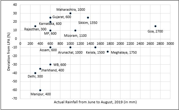
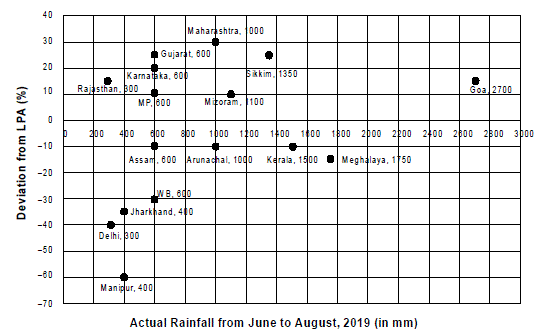
To compare the rainfall data, India Meteorological Department (IMD) calculated the Long Period Average (LPA) of rainfall during period June-August for each of the 16 states. The figure given below shows the actual rainfall (measured in mm) during June-August, 2019 and the percentage deviations from LPA of respective states in 2018. Each state along with its actual rainfall is presented in the figure.
Figure for this questionFigure for this question

If a ‘Heavy Monsoon State’ is defined as a state with actual rainfall from June-August, 2019 of 900 mm or more, then approximately what percentage of ‘Heavy Monsoon States’ have a negative deviation from respective LPAs in 2019?

Q55CAT 2019 · Slot 2✓ Answer verified

Set 2 : Rainfall

To compare the rainfall data, India Meteorological Department (IMD) calculated the Long Period Average (LPA) of rainfall during period June-August for each of the 16 states. The figure given below shows the actual rainfall (measured in mm) during June-August, 2019 and the percentage deviations from LPA of respective states in 2018. Each state along with its actual rainfall is presented in the figure.
Figure for this questionFigure for this question

If a ‘Low Monsoon State’ is defined as a state with actual rainfall from June-August, 2019 of 750 mm or less, then what is the median ‘deviation from LPA’ (as defined in the Y-axis of the figure) of ‘Low Monsoon States’?

Q56CAT 2019 · Slot 2✓ Answer verified

Set 2 : Rainfall

To compare the rainfall data, India Meteorological Department (IMD) calculated the Long Period Average (LPA) of rainfall during period June-August for each of the 16 states. The figure given below shows the actual rainfall (measured in mm) during June-August, 2019 and the percentage deviations from LPA of respective states in 2018. Each state along with its actual rainfall is presented in the figure.
Figure for this questionFigure for this question

What is the average rainfall of all states that have actual rainfall of 600 mm or less in 2019 and have a negative deviation from LPA?

Q57CAT 2019 · Slot 2✓ Answer verified

Set 2 : Rainfall

To compare the rainfall data, India Meteorological Department (IMD) calculated the Long Period Average (LPA) of rainfall during period June-August for each of the 16 states. The figure given below shows the actual rainfall (measured in mm) during June-August, 2019 and the percentage deviations from LPA of respective states in 2018. Each state along with its actual rainfall is presented in the figure.
Figure for this questionFigure for this question

The LPA of a state for a year is defined as the average rainfall in the preceding 10 years considering the period of June-August. For example, LPA in 2018 is the average rainfall during 2009-2018 and LPA in 2019 is the average rainfall during 2010-2019. It is also observed that the actual rainfall in Gujarat in 2019 is 20% more than the rainfall in 2009. The LPA of Gujarat in 2019 is closest to

Q58CAT 2019 · Slot 2✓ Answer verified

Set 6 : MT & ET

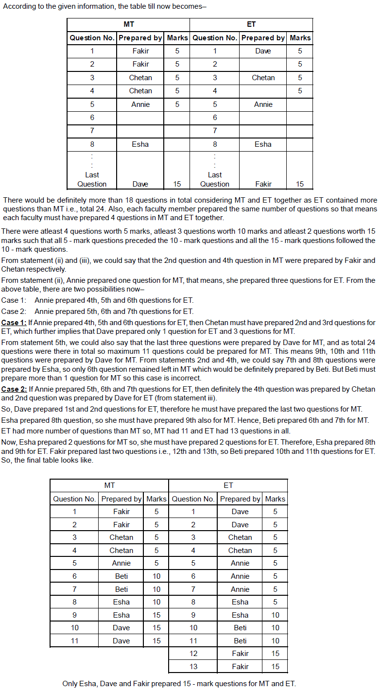
The first year students in a business school are split into six sections. In 2019 the Business Statistics course was taught in these six sections by Annie, Beti, Chetan, Dave, Esha, and Fakir. All six sections had a common midterm (MT) and a common endterm (ET) worth 100 marks each. ET contained more questions than MT. Questions for MT and ET were prepared collectively by the six faculty members. Considering MT and ET together, each faculty member prepared the same number of questions. Each of MT and ET had at least four questions that were worth 5 marks, at least three questions that were worth 10 marks, and at least two questions that were worth 15 marks. In both MT and ET, all the 5-mark questions preceded the 10-mark questions, and all the 15-mark questions followed the 10-mark questions. The following additional facts are known. i. Annie prepared the fifth question for both MT and ET. For MT, this question carried 5 marks. ii. Annie prepared one question for MT. Every other faculty member prepared more than one questions for MT. iii. All questions prepared by a faculty member appeared consecutively in MT as well as ET. iv. Chetan prepared the third question in both MT and ET; and Esha prepared the eighth question in both. v. Fakir prepared the first question of MT and the last one in ET. Dave prepared the last question of MT and the first one in ET.
Figure for this question

The second question in ET was prepared by:

Q59CAT 2019 · Slot 2✓ Answer verified

Set 6 : MT & ET

The first year students in a business school are split into six sections. In 2019 the Business Statistics course was taught in these six sections by Annie, Beti, Chetan, Dave, Esha, and Fakir. All six sections had a common midterm (MT) and a common endterm (ET) worth 100 marks each. ET contained more questions than MT. Questions for MT and ET were prepared collectively by the six faculty members. Considering MT and ET together, each faculty member prepared the same number of questions. Each of MT and ET had at least four questions that were worth 5 marks, at least three questions that were worth 10 marks, and at least two questions that were worth 15 marks. In both MT and ET, all the 5-mark questions preceded the 10-mark questions, and all the 15-mark questions followed the 10-mark questions. The following additional facts are known. i. Annie prepared the fifth question for both MT and ET. For MT, this question carried 5 marks. ii. Annie prepared one question for MT. Every other faculty member prepared more than one questions for MT. iii. All questions prepared by a faculty member appeared consecutively in MT as well as ET. iv. Chetan prepared the third question in both MT and ET; and Esha prepared the eighth question in both. v. Fakir prepared the first question of MT and the last one in ET. Dave prepared the last question of MT and the first one in ET.
Figure for this question

How many 5‐mark questions were there in MT and ET combined?

Q60CAT 2019 · Slot 2✓ Answer verified

Set 6 : MT & ET

The first year students in a business school are split into six sections. In 2019 the Business Statistics course was taught in these six sections by Annie, Beti, Chetan, Dave, Esha, and Fakir. All six sections had a common midterm (MT) and a common endterm (ET) worth 100 marks each. ET contained more questions than MT. Questions for MT and ET were prepared collectively by the six faculty members. Considering MT and ET together, each faculty member prepared the same number of questions. Each of MT and ET had at least four questions that were worth 5 marks, at least three questions that were worth 10 marks, and at least two questions that were worth 15 marks. In both MT and ET, all the 5-mark questions preceded the 10-mark questions, and all the 15-mark questions followed the 10-mark questions. The following additional facts are known. i. Annie prepared the fifth question for both MT and ET. For MT, this question carried 5 marks. ii. Annie prepared one question for MT. Every other faculty member prepared more than one questions for MT. iii. All questions prepared by a faculty member appeared consecutively in MT as well as ET. iv. Chetan prepared the third question in both MT and ET; and Esha prepared the eighth question in both. v. Fakir prepared the first question of MT and the last one in ET. Dave prepared the last question of MT and the first one in ET.
Figure for this question

Who prepared 15-mark questions for MT and ET?

Q61CAT 2019 · Slot 2✓ Answer verified

Set 6 : MT & ET

The first year students in a business school are split into six sections. In 2019 the Business Statistics course was taught in these six sections by Annie, Beti, Chetan, Dave, Esha, and Fakir. All six sections had a common midterm (MT) and a common endterm (ET) worth 100 marks each. ET contained more questions than MT. Questions for MT and ET were prepared collectively by the six faculty members. Considering MT and ET together, each faculty member prepared the same number of questions. Each of MT and ET had at least four questions that were worth 5 marks, at least three questions that were worth 10 marks, and at least two questions that were worth 15 marks. In both MT and ET, all the 5-mark questions preceded the 10-mark questions, and all the 15-mark questions followed the 10-mark questions. The following additional facts are known. i. Annie prepared the fifth question for both MT and ET. For MT, this question carried 5 marks. ii. Annie prepared one question for MT. Every other faculty member prepared more than one questions for MT. iii. All questions prepared by a faculty member appeared consecutively in MT as well as ET. iv. Chetan prepared the third question in both MT and ET; and Esha prepared the eighth question in both. v. Fakir prepared the first question of MT and the last one in ET. Dave prepared the last question of MT and the first one in ET.
Figure for this question

Which of the following questions did Beti prepare in ET?

Q62CAT 2019 · Slot 2 · TITA✓ Answer verified

Set 8 : Revenue & Cost

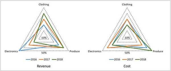
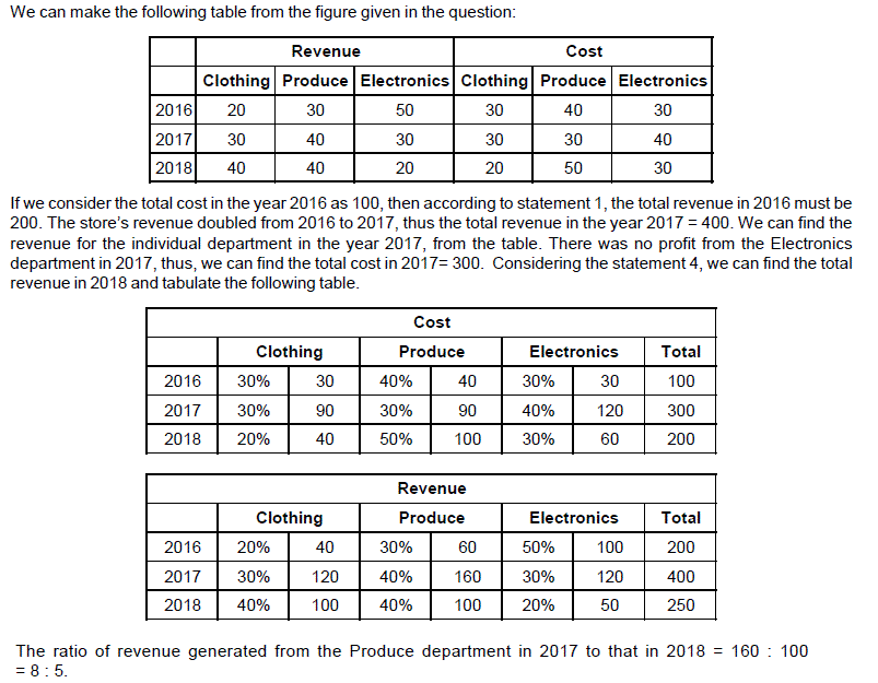
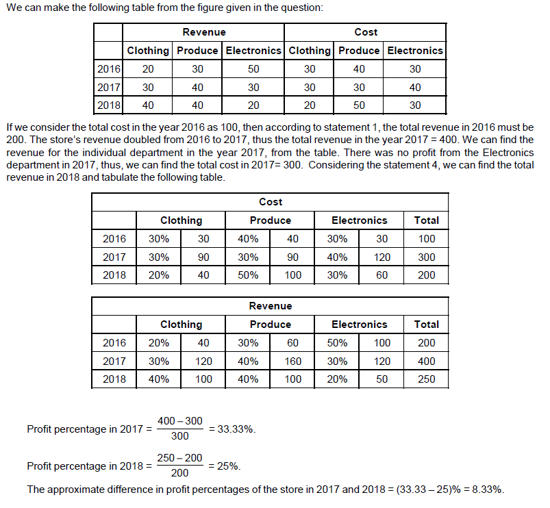
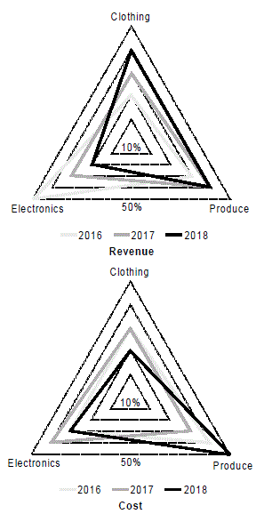
A large store has only three departments, Clothing, Produce, and Electronics. The following figure shows the percentages of revenue and cost from the three departments for the years 2016, 2017 and 2018. The dotted lines depict percentage levels. So for example, in 2016, 50% of store's revenue came from its Electronics department while 40% of its costs were incurred in the Produce department. In this setup, Profit is computed as (Revenue – Cost) and Percentage Profit as Profit/Cost × 100%. It is known that 1. The percentage profit for the store in 2016 was 100%. 2. The store’s revenue doubled from 2016 to 2017, and its cost doubled from 2016 to 2018. 3. There was no profit from the Electronics department in 2017. 4. In 2018, the revenue from the Clothing department was the same as the cost incurred in the Produce department.
Figure for this questionFigure for this question

What was the percentage profit of the store in 2018? [TITA]

Q63CAT 2019 · Slot 2✓ Answer verified

Set 8 : Revenue & Cost

A large store has only three departments, Clothing, Produce, and Electronics. The following figure shows the percentages of revenue and cost from the three departments for the years 2016, 2017 and 2018. The dotted lines depict percentage levels. So for example, in 2016, 50% of store's revenue came from its Electronics department while 40% of its costs were incurred in the Produce department. In this setup, Profit is computed as (Revenue – Cost) and Percentage Profit as Profit/Cost × 100%. It is known that 1. The percentage profit for the store in 2016 was 100%. 2. The store’s revenue doubled from 2016 to 2017, and its cost doubled from 2016 to 2018. 3. There was no profit from the Electronics department in 2017. 4. In 2018, the revenue from the Clothing department was the same as the cost incurred in the Produce department.
Figure for this questionFigure for this question

What was the ratio of revenue generated from the Produce department In 2017 to that in 2018?

Q64CAT 2019 · Slot 2 · TITA✓ Answer verified

Set 8 : Revenue & Cost

A large store has only three departments, Clothing, Produce, and Electronics. The following figure shows the percentages of revenue and cost from the three departments for the years 2016, 2017 and 2018. The dotted lines depict percentage levels. So for example, in 2016, 50% of store's revenue came from its Electronics department while 40% of its costs were incurred in the Produce department. In this setup, Profit is computed as (Revenue – Cost) and Percentage Profit as Profit/Cost × 100%. It is known that 1. The percentage profit for the store in 2016 was 100%. 2. The store’s revenue doubled from 2016 to 2017, and its cost doubled from 2016 to 2018. 3. There was no profit from the Electronics department in 2017. 4. In 2018, the revenue from the Clothing department was the same as the cost incurred in the Produce department.
Figure for this questionFigure for this question

What percentage of the total profits for the store in 2016 was from the Electronics department? [TITA]

Q65CAT 2019 · Slot 2✓ Answer verified

Set 8 : Revenue & Cost

A large store has only three departments, Clothing, Produce, and Electronics. The following figure shows the percentages of revenue and cost from the three departments for the years 2016, 2017 and 2018. The dotted lines depict percentage levels. So for example, in 2016, 50% of store's revenue came from its Electronics department while 40% of its costs were incurred in the Produce department. In this setup, Profit is computed as (Revenue – Cost) and Percentage Profit as Profit/Cost × 100%. It is known that 1. The percentage profit for the store in 2016 was 100%. 2. The store’s revenue doubled from 2016 to 2017, and its cost doubled from 2016 to 2018. 3. There was no profit from the Electronics department in 2017. 4. In 2018, the revenue from the Clothing department was the same as the cost incurred in the Produce department.
Figure for this questionFigure for this question

What was the approximate difference in profit percentages of the store in 2017 and 2018?

Q66CAT 2019 · Slot 1 · TITA✓ Answer verified

Set 3 : Crimes

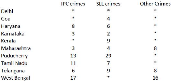
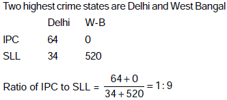
The Ministry of Home Affairs is analysing crimes committed by foreigners in different states and union territories (UT) of India. All cases refer to the ones registered against foreigners in 2016. The number of cases – classified into three categories: IPC crimes, SLL crimes and other crimes – for nine states/UTs are shown in the figure below. These nine belong to the top ten states/UTs in terms of the total number of cases registered. The remaining state (among top ten) is West Bengal, where all the 520 cases registered were SLL crimes. The table below shows the ranks of the ten states/UTs mentioned above among ALL states/UTs of India in terms of the number of cases registered in each of the three category of crimes. A state/UT is given rank r for a category of crimes if there are (r‐1) states/UTs having a larger number of cases registered in that category of crimes. For example, if two states have the same number of cases in a category, and exactly three other states/UTs have larger numbers of cases registered in the same category, then both the states are given rank 4 in that category. Missing ranks in the table are denoted by ×
Figure for this questionFigure for this question

What is the rank of Kerala in the ‘IPC crimes’ category? (TITA)

Q67CAT 2019 · Slot 1✓ Answer verified

Set 3 : Crimes

The Ministry of Home Affairs is analysing crimes committed by foreigners in different states and union territories (UT) of India. All cases refer to the ones registered against foreigners in 2016. The number of cases – classified into three categories: IPC crimes, SLL crimes and other crimes – for nine states/UTs are shown in the figure below. These nine belong to the top ten states/UTs in terms of the total number of cases registered. The remaining state (among top ten) is West Bengal, where all the 520 cases registered were SLL crimes. The table below shows the ranks of the ten states/UTs mentioned above among ALL states/UTs of India in terms of the number of cases registered in each of the three category of crimes. A state/UT is given rank r for a category of crimes if there are (r‐1) states/UTs having a larger number of cases registered in that category of crimes. For example, if two states have the same number of cases in a category, and exactly three other states/UTs have larger numbers of cases registered in the same category, then both the states are given rank 4 in that category. Missing ranks in the table are denoted by ×
Figure for this questionFigure for this questionFigure for this question

In the two states where the highest total number of cases are registered, the ratio of the total number of cases in IPC crimes to the total number in SLL crimes is closest to

Q68CAT 2019 · Slot 1

Set 3 : Crimes

The Ministry of Home Affairs is analysing crimes committed by foreigners in different states and union territories (UT) of India. All cases refer to the ones registered against foreigners in 2016. The number of cases – classified into three categories: IPC crimes, SLL crimes and other crimes – for nine states/UTs are shown in the figure below. These nine belong to the top ten states/UTs in terms of the total number of cases registered. The remaining state (among top ten) is West Bengal, where all the 520 cases registered were SLL crimes. The table below shows the ranks of the ten states/UTs mentioned above among ALL states/UTs of India in terms of the number of cases registered in each of the three category of crimes. A state/UT is given rank r for a category of crimes if there are (r‐1) states/UTs having a larger number of cases registered in that category of crimes. For example, if two states have the same number of cases in a category, and exactly three other states/UTs have larger numbers of cases registered in the same category, then both the states are given rank 4 in that category. Missing ranks in the table are denoted by ×
Figure for this questionFigure for this question

Which of the following is DEFINITELY true about the ranks of states/UT in the ‘other crimes’ category? i) Tamil Nadu: 2 ii) Puducherry: 3

Q69CAT 2019 · Slot 1 · TITA✓ Answer verified

Set 3 : Crimes

The Ministry of Home Affairs is analysing crimes committed by foreigners in different states and union territories (UT) of India. All cases refer to the ones registered against foreigners in 2016. The number of cases – classified into three categories: IPC crimes, SLL crimes and other crimes – for nine states/UTs are shown in the figure below. These nine belong to the top ten states/UTs in terms of the total number of cases registered. The remaining state (among top ten) is West Bengal, where all the 520 cases registered were SLL crimes. The table below shows the ranks of the ten states/UTs mentioned above among ALL states/UTs of India in terms of the number of cases registered in each of the three category of crimes. A state/UT is given rank r for a category of crimes if there are (r‐1) states/UTs having a larger number of cases registered in that category of crimes. For example, if two states have the same number of cases in a category, and exactly three other states/UTs have larger numbers of cases registered in the same category, then both the states are given rank 4 in that category. Missing ranks in the table are denoted by ×
Figure for this questionFigure for this questionFigure for this question

What is the sum of the ranks of Delhi in the three categories of crimes? (TITA)

Q70CAT 2019 · Slot 1✓ Answer verified

Set 4 : Vendor

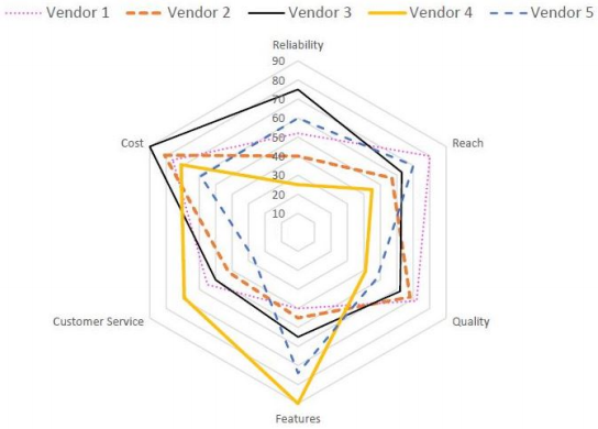
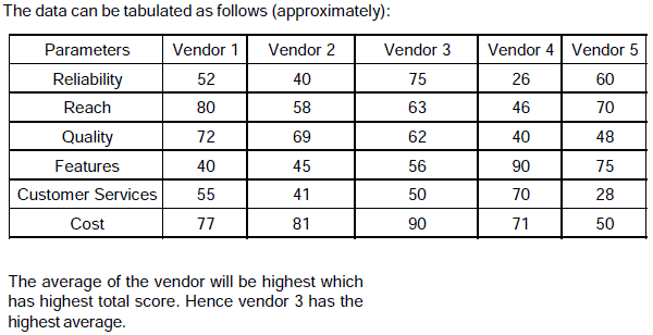
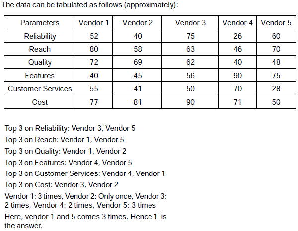
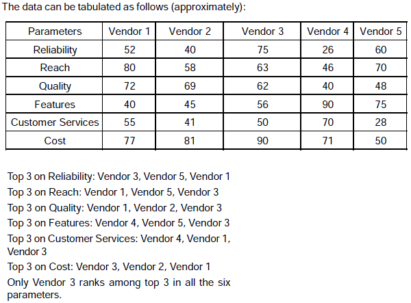
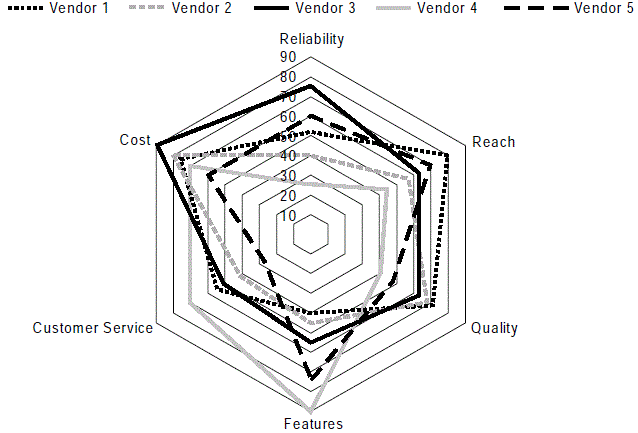
Five vendors are being considered for a service. The evaluation committee evaluated each vendor on six aspects – Cost, Customer Service, Features, Quality, Reach, and Reliability. Each of these evaluations are on a scale of 0 (worst) to 100 (perfect). The evaluation scores on these aspects are shown in the radar chart. For example, Vendor 1 obtains a score of 52 on Reliability, Vendor 2 obtains a score of 45 on Features and Vendor 3 obtains a score of 90 on Cost
Figure for this questionFigure for this question

On which aspect is the median score of the five vendors the least?

Q71CAT 2019 · Slot 1✓ Answer verified

Set 4 : Vendor

Five vendors are being considered for a service. The evaluation committee evaluated each vendor on six aspects – Cost, Customer Service, Features, Quality, Reach, and Reliability. Each of these evaluations are on a scale of 0 (worst) to 100 (perfect). The evaluation scores on these aspects are shown in the radar chart. For example, Vendor 1 obtains a score of 52 on Reliability, Vendor 2 obtains a score of 45 on Features and Vendor 3 obtains a score of 90 on Cost
Figure for this questionFigure for this question

A vendor's final score is the average of their scores on all six aspects. Which vendor has the highest final score?

Q72CAT 2019 · Slot 1✓ Answer verified

Set 4 : Vendor

Five vendors are being considered for a service. The evaluation committee evaluated each vendor on six aspects – Cost, Customer Service, Features, Quality, Reach, and Reliability. Each of these evaluations are on a scale of 0 (worst) to 100 (perfect). The evaluation scores on these aspects are shown in the radar chart. For example, Vendor 1 obtains a score of 52 on Reliability, Vendor 2 obtains a score of 45 on Features and Vendor 3 obtains a score of 90 on Cost
Figure for this questionFigure for this question

List of all the vendors who are among the top two scorers on the maximum number of aspects is:

Q73CAT 2019 · Slot 1✓ Answer verified

Set 4 : Vendor

Five vendors are being considered for a service. The evaluation committee evaluated each vendor on six aspects – Cost, Customer Service, Features, Quality, Reach, and Reliability. Each of these evaluations are on a scale of 0 (worst) to 100 (perfect). The evaluation scores on these aspects are shown in the radar chart. For example, Vendor 1 obtains a score of 52 on Reliability, Vendor 2 obtains a score of 45 on Features and Vendor 3 obtains a score of 90 on Cost
Figure for this questionFigure for this question

List of all the vendors who are among the top three vendors on all six aspects is:

Q74CAT 2019 · Slot 1 · TITA✓ Answer verified
The Ministry of Home Affairs is analysing crimes committed by foreigners in different states and union territories (UT) of India. All cases refer to the ones registered against foreigners in 2016. The number of cases – classified into three categories: IPC crimes, SLL crimes and other crimes – for nine states/UTs are shown in the figure below. These nine belong to the top ten states/UTs in terms of the total number of cases registered. The remaining state (among top ten) is West Bengal, where all the 520 cases registered were SLL crimes. The table below shows the ranks of the ten states/UTs mentioned above among ALL states/UTs of India in terms of the number of cases registered in each of the three category of crimes. A state/UT is given rank r for a category of crimes if there are (r-1) states/UTs having a larger number of cases registered in that category of crimes. For example, if two states have the same number of cases in a category, and exactly three other states/ UTs have larger numbers of cases registered in the same category, then both the states are given rank 4 in that category. Missing ranks in the table are denoted by ×.
Figure for this questionFigure for this question

Q. 1 What is the rank of Kerala in the ‘IPC crimes’ category?

Q75CAT 2019 · Slot 1✓ Answer verified
The Ministry of Home Affairs is analysing crimes committed by foreigners in different states and union territories (UT) of India. All cases refer to the ones registered against foreigners in 2016. The number of cases – classified into three categories: IPC crimes, SLL crimes and other crimes – for nine states/UTs are shown in the figure below. These nine belong to the top ten states/UTs in terms of the total number of cases registered. The remaining state (among top ten) is West Bengal, where all the 520 cases registered were SLL crimes. The table below shows the ranks of the ten states/UTs mentioned above among ALL states/UTs of India in terms of the number of cases registered in each of the three category of crimes. A state/UT is given rank r for a category of crimes if there are (r-1) states/UTs having a larger number of cases registered in that category of crimes. For example, if two states have the same number of cases in a category, and exactly three other states/ UTs have larger numbers of cases registered in the same category, then both the states are given rank 4 in that category. Missing ranks in the table are denoted by ×.
Figure for this questionFigure for this question

Q. 2 In the two states where the highest total number of cases are registered, the ratio of the total number of cases in IPC crimes to the total number in SLL crimes is closest to

Q76CAT 2019 · Slot 1✓ Answer verified
The Ministry of Home Affairs is analysing crimes committed by foreigners in different states and union territories (UT) of India. All cases refer to the ones registered against foreigners in 2016. The number of cases – classified into three categories: IPC crimes, SLL crimes and other crimes – for nine states/UTs are shown in the figure below. These nine belong to the top ten states/UTs in terms of the total number of cases registered. The remaining state (among top ten) is West Bengal, where all the 520 cases registered were SLL crimes. The table below shows the ranks of the ten states/UTs mentioned above among ALL states/UTs of India in terms of the number of cases registered in each of the three category of crimes. A state/UT is given rank r for a category of crimes if there are (r-1) states/UTs having a larger number of cases registered in that category of crimes. For example, if two states have the same number of cases in a category, and exactly three other states/ UTs have larger numbers of cases registered in the same category, then both the states are given rank 4 in that category. Missing ranks in the table are denoted by ×.
Figure for this questionFigure for this question

Q. 3 Which of the following is DEFINITELY true about the ranks of states/UT in the ‘other crimes’ category? i) Tamil Nadu: 2 ii) Puducherry: 3

Q77CAT 2019 · Slot 1 · TITA
The Ministry of Home Affairs is analysing crimes committed by foreigners in different states and union territories (UT) of India. All cases refer to the ones registered against foreigners in 2016. The number of cases – classified into three categories: IPC crimes, SLL crimes and other crimes – for nine states/UTs are shown in the figure below. These nine belong to the top ten states/UTs in terms of the total number of cases registered. The remaining state (among top ten) is West Bengal, where all the 520 cases registered were SLL crimes. The table below shows the ranks of the ten states/UTs mentioned above among ALL states/UTs of India in terms of the number of cases registered in each of the three category of crimes. A state/UT is given rank r for a category of crimes if there are (r-1) states/UTs having a larger number of cases registered in that category of crimes. For example, if two states have the same number of cases in a category, and exactly three other states/ UTs have larger numbers of cases registered in the same category, then both the states are given rank 4 in that category. Missing ranks in the table are denoted by ×.
Figure for this questionFigure for this question

Q. 4 What is the sum of the ranks of Delhi in the three categories of crimes?

Q78CAT 2019✓ Answer verified

Rainfall

To compare the rainfall data, India Meteorological Department (IMD) calculated the Long Period Average (LPA) of rainfall during period June-August for each of the 16 states. The figure given below shows the actual rainfall (measured in mm) during June-August, 2019 and the percentage deviations from LPA of respective states in 2018. Each state along with its actual rainfall is presented in the figure.
Figure for this question

If a ‘Heavy Monsoon State’ is defined as a state with actual rainfall from June-August, 2019 of 900 mm or more, then approximately what percentage of ‘Heavy Monsoon States’ have a negative deviation from respective LPAs in 2019?

Q79CAT 2019✓ Answer verified

Rainfall

To compare the rainfall data, India Meteorological Department (IMD) calculated the Long Period Average (LPA) of rainfall during period June-August for each of the 16 states. The figure given below shows the actual rainfall (measured in mm) during June-August, 2019 and the percentage deviations from LPA of respective states in 2018. Each state along with its actual rainfall is presented in the figure.
Figure for this question

If a ‘Low Monsoon State’ is defined as a state with actual rainfall from June-August, 2019 of 750 mm or less, then what is the median ‘deviation from LPA’ (as defined in the Y-axis of the figure) of ‘Low Monsoon States’?

Q80CAT 2019✓ Answer verified

Rainfall

To compare the rainfall data, India Meteorological Department (IMD) calculated the Long Period Average (LPA) of rainfall during period June-August for each of the 16 states. The figure given below shows the actual rainfall (measured in mm) during June-August, 2019 and the percentage deviations from LPA of respective states in 2018. Each state along with its actual rainfall is presented in the figure.
Figure for this question

What is the average rainfall of all states that have actual rainfall of 600 mm or less in 2019 and have a negative deviation from LPA?

Q81CAT 2019✓ Answer verified

Rainfall

To compare the rainfall data, India Meteorological Department (IMD) calculated the Long Period Average (LPA) of rainfall during period June-August for each of the 16 states. The figure given below shows the actual rainfall (measured in mm) during June-August, 2019 and the percentage deviations from LPA of respective states in 2018. Each state along with its actual rainfall is presented in the figure.
Figure for this question

The LPA of a state for a year is defined as the average rainfall in the preceding 10 years considering the period of June-August. For example, LPA in 2018 is the average rainfall during 2009-2018 and LPA in 2019 is the average rainfall during 2010-2019. It is also observed that the actual rainfall in Gujarat in 2019 is 20% more than the rainfall in 2009. The LPA of Gujarat in 2019 is closest to

Q82CAT 2019 · TITA✓ Answer verified
A large store has only three departments, Clothing, Produce, and Electronics. The following figure shows the percentages of revenue and cost from the three departments for the years 2016, 2017 and 2018. The dotted lines depict percentage levels. So for example, in 2016, 50% of store's revenue came from its Electronics department while 40% of its costs were incurred in the Produce department. In this setup, Profit is computed as (Revenue – Cost) and Percentage Profit as Profit/Cost × 100%. It is known that 1. The percentage profit for the store in 2016 was 100%. 2. The store’s revenue doubled from 2016 to 2017, and its cost doubled from 2016 to 2018. 3. There was no profit from the Electronics department in 2017. 4. In 2018, the revenue from the Clothing department was the same as the cost incurred in the Produce department.
Figure for this question

Q. 1 What was the percentage profit of the store in 2018?

Q83CAT 2019✓ Answer verified
A large store has only three departments, Clothing, Produce, and Electronics. The following figure shows the percentages of revenue and cost from the three departments for the years 2016, 2017 and 2018. The dotted lines depict percentage levels. So for example, in 2016, 50% of store's revenue came from its Electronics department while 40% of its costs were incurred in the Produce department. In this setup, Profit is computed as (Revenue – Cost) and Percentage Profit as Profit/Cost × 100%. It is known that 1. The percentage profit for the store in 2016 was 100%. 2. The store’s revenue doubled from 2016 to 2017, and its cost doubled from 2016 to 2018. 3. There was no profit from the Electronics department in 2017. 4. In 2018, the revenue from the Clothing department was the same as the cost incurred in the Produce department.
Figure for this question

Q. 2 What was the ratio of revenue generated from the Produce department in 2017 to that in 2018?

Q84CAT 2019 · TITA✓ Answer verified
A large store has only three departments, Clothing, Produce, and Electronics. The following figure shows the percentages of revenue and cost from the three departments for the years 2016, 2017 and 2018. The dotted lines depict percentage levels. So for example, in 2016, 50% of store's revenue came from its Electronics department while 40% of its costs were incurred in the Produce department. In this setup, Profit is computed as (Revenue – Cost) and Percentage Profit as Profit/Cost × 100%. It is known that 1. The percentage profit for the store in 2016 was 100%. 2. The store’s revenue doubled from 2016 to 2017, and its cost doubled from 2016 to 2018. 3. There was no profit from the Electronics department in 2017. 4. In 2018, the revenue from the Clothing department was the same as the cost incurred in the Produce department.
Figure for this question

Q. 3 What percentage of the total profits for the store in 2016 was from the Electronics department?

Q85CAT 2019✓ Answer verified
A large store has only three departments, Clothing, Produce, and Electronics. The following figure shows the percentages of revenue and cost from the three departments for the years 2016, 2017 and 2018. The dotted lines depict percentage levels. So for example, in 2016, 50% of store's revenue came from its Electronics department while 40% of its costs were incurred in the Produce department. In this setup, Profit is computed as (Revenue – Cost) and Percentage Profit as Profit/Cost × 100%. It is known that 1. The percentage profit for the store in 2016 was 100%. 2. The store’s revenue doubled from 2016 to 2017, and its cost doubled from 2016 to 2018. 3. There was no profit from the Electronics department in 2017. 4. In 2018, the revenue from the Clothing department was the same as the cost incurred in the Produce department.
Figure for this question

Q. 4 What was the approximate difference in profit percentages of the store in 2017 and 2018?

Q86CAT 2019✓ Answer verified
Five vendors are being considered for a service. The evaluation committee evaluated each vendor on six aspects – Cost, Customer Service, Features, Quality, Reach, and Reliability. Each of these evaluations are on a scale of 0 (worst) to 100 (perfect). The evaluation scores on these aspects are shown in the radar chart. For example, Vendor 1 obtains a score of 52 on Reliability, Vendor 2 obtains a score of 45 on Features and Vendor 3 obtains a score of 90 on Cost.
Figure for this question

Q. 1 On which aspect is the median score of the five vendors the least?

Q87CAT 2019✓ Answer verified
Five vendors are being considered for a service. The evaluation committee evaluated each vendor on six aspects – Cost, Customer Service, Features, Quality, Reach, and Reliability. Each of these evaluations are on a scale of 0 (worst) to 100 (perfect). The evaluation scores on these aspects are shown in the radar chart. For example, Vendor 1 obtains a score of 52 on Reliability, Vendor 2 obtains a score of 45 on Features and Vendor 3 obtains a score of 90 on Cost.
Figure for this question

Q. 2 A vendor's final score is the average of their scores on all six aspects. Which vendor has the highest final score?

Q88CAT 2019✓ Answer verified
Five vendors are being considered for a service. The evaluation committee evaluated each vendor on six aspects – Cost, Customer Service, Features, Quality, Reach, and Reliability. Each of these evaluations are on a scale of 0 (worst) to 100 (perfect). The evaluation scores on these aspects are shown in the radar chart. For example, Vendor 1 obtains a score of 52 on Reliability, Vendor 2 obtains a score of 45 on Features and Vendor 3 obtains a score of 90 on Cost.
Figure for this question

Q. 3 List of all the vendors who are among the top two scorers on the maximum number of aspects is:

Q89CAT 2019✓ Answer verified
Five vendors are being considered for a service. The evaluation committee evaluated each vendor on six aspects – Cost, Customer Service, Features, Quality, Reach, and Reliability. Each of these evaluations are on a scale of 0 (worst) to 100 (perfect). The evaluation scores on these aspects are shown in the radar chart. For example, Vendor 1 obtains a score of 52 on Reliability, Vendor 2 obtains a score of 45 on Features and Vendor 3 obtains a score of 90 on Cost.
Figure for this question

Q. 4 List of all the vendors who are among the top three vendors on all six aspects is:

Q90CAT 2018 · Slot 2✓ Answer verified

Set 1: College Accreditation

An agency entrusted to accredit colleges looks at four parameters: faculty quality (F), reputation (R), placement quality (P), and infrastructure (I). The four parameters are used to arrive at an overall score, which the agency uses to give an accreditation to the colleges. In each parameter, there are five possible letter grades given, each carrying certain points: A (50 points), B (40 points), C (30 points), D (20 points), and F (0 points). The overall score for a college is the weighted sum of the points scored in the four parameters. The weights of the parameters are 0.1, 0.2, 0.3 and 0.4 in some order, but the order is not disclosed. Accreditation is awarded based on the following scheme: Eight colleges apply for accreditation, and receive the following grades in the four parameters (F, R, P, and I): It is further known that in terms of overall scores: 1. High Q is better than Best Ed. 2. Best Ed is better than Cosmopolitan. 3. Education Aid is better than A-one.
Figure for this questionFigure for this questionFigure for this questionFigure for this questionFigure for this questionFigure for this question

What is the weight of the faculty quality parameter?

Q91CAT 2018 · Slot 2 · TITA✓ Answer verified

Set 1: College Accreditation

An agency entrusted to accredit colleges looks at four parameters: faculty quality (F), reputation (R), placement quality (P), and infrastructure (I). The four parameters are used to arrive at an overall score, which the agency uses to give an accreditation to the colleges. In each parameter, there are five possible letter grades given, each carrying certain points: A (50 points), B (40 points), C (30 points), D (20 points), and F (0 points). The overall score for a college is the weighted sum of the points scored in the four parameters. The weights of the parameters are 0.1, 0.2, 0.3 and 0.4 in some order, but the order is not disclosed. Accreditation is awarded based on the following scheme: Eight colleges apply for accreditation, and receive the following grades in the four parameters (F, R, P, and I): It is further known that in terms of overall scores: 1. High Q is better than Best Ed. 2. Best Ed is better than Cosmopolitan. 3. Education Aid is better than A-one.
Figure for this questionFigure for this questionFigure for this questionFigure for this questionFigure for this questionFigure for this question

How many colleges receive the accreditation of AAA? [TITA]

Q92CAT 2018 · Slot 2 · TITA✓ Answer verified

Set 1: College Accreditation

An agency entrusted to accredit colleges looks at four parameters: faculty quality (F), reputation (R), placement quality (P), and infrastructure (I). The four parameters are used to arrive at an overall score, which the agency uses to give an accreditation to the colleges. In each parameter, there are five possible letter grades given, each carrying certain points: A (50 points), B (40 points), C (30 points), D (20 points), and F (0 points). The overall score for a college is the weighted sum of the points scored in the four parameters. The weights of the parameters are 0.1, 0.2, 0.3 and 0.4 in some order, but the order is not disclosed. Accreditation is awarded based on the following scheme: Eight colleges apply for accreditation, and receive the following grades in the four parameters (F, R, P, and I): It is further known that in terms of overall scores: 1. High Q is better than Best Ed. 2. Best Ed is better than Cosmopolitan. 3. Education Aid is better than A-one.
Figure for this questionFigure for this questionFigure for this questionFigure for this questionFigure for this questionFigure for this question

What is the highest overall score among the eight colleges? [TITA]

Q93CAT 2018 · Slot 2✓ Answer verified

Set 1: College Accreditation

An agency entrusted to accredit colleges looks at four parameters: faculty quality (F), reputation (R), placement quality (P), and infrastructure (I). The four parameters are used to arrive at an overall score, which the agency uses to give an accreditation to the colleges. In each parameter, there are five possible letter grades given, each carrying certain points: A (50 points), B (40 points), C (30 points), D (20 points), and F (0 points). The overall score for a college is the weighted sum of the points scored in the four parameters. The weights of the parameters are 0.1, 0.2, 0.3 and 0.4 in some order, but the order is not disclosed. Accreditation is awarded based on the following scheme: Eight colleges apply for accreditation, and receive the following grades in the four parameters (F, R, P, and I): It is further known that in terms of overall scores: 1. High Q is better than Best Ed. 2. Best Ed is better than Cosmopolitan. 3. Education Aid is better than A-one.
Figure for this questionFigure for this questionFigure for this questionFigure for this questionFigure for this questionFigure for this question

How many colleges have overall scores between 31 and 40, both inclusive?

Q94CAT 2018 · Slot 2✓ Answer verified

Set 2 : Smartphones

There are only four brands of entry level smartphones called Azra, Bysi, Cxqi, and Dipq in a country. Details about their market share, unit selling price, and profitability (defined as the profit as a percentage of the revenue) for the year 2016 are given in the table below: In 2017, sales volume of entry level smartphones grew by 40% as compared to that in 2016. Cxqi offered a 40% discount on its unit selling price in 2017, which resulted in a 15% increase in its market share. Each of the other three brands lost 5% market share. However, the profitability of Cxqi came down to half of its value in 2016. The unit selling prices of the other three brands and their profitability values remained the same in 2017 as they were in 2016.
Figure for this questionFigure for this questionFigure for this questionFigure for this questionFigure for this questionFigure for this question

The brand that had the highest revenue in 2016 is:

Q95CAT 2018 · Slot 2✓ Answer verified

Set 2 : Smartphones

There are only four brands of entry level smartphones called Azra, Bysi, Cxqi, and Dipq in a country. Details about their market share, unit selling price, and profitability (defined as the profit as a percentage of the revenue) for the year 2016 are given in the table below: In 2017, sales volume of entry level smartphones grew by 40% as compared to that in 2016. Cxqi offered a 40% discount on its unit selling price in 2017, which resulted in a 15% increase in its market share. Each of the other three brands lost 5% market share. However, the profitability of Cxqi came down to half of its value in 2016. The unit selling prices of the other three brands and their profitability values remained the same in 2017 as they were in 2016.
Figure for this questionFigure for this questionFigure for this questionFigure for this questionFigure for this questionFigure for this question

The brand that had the highest profit in 2016 is:

Q96CAT 2018 · Slot 2✓ Answer verified

Set 2 : Smartphones

There are only four brands of entry level smartphones called Azra, Bysi, Cxqi, and Dipq in a country. Details about their market share, unit selling price, and profitability (defined as the profit as a percentage of the revenue) for the year 2016 are given in the table below: In 2017, sales volume of entry level smartphones grew by 40% as compared to that in 2016. Cxqi offered a 40% discount on its unit selling price in 2017, which resulted in a 15% increase in its market share. Each of the other three brands lost 5% market share. However, the profitability of Cxqi came down to half of its value in 2016. The unit selling prices of the other three brands and their profitability values remained the same in 2017 as they were in 2016.
Figure for this questionFigure for this questionFigure for this questionFigure for this questionFigure for this questionFigure for this question

The brand that had the highest profit in 2017 is:

Q97CAT 2018 · Slot 2✓ Answer verified

Set 2 : Smartphones

There are only four brands of entry level smartphones called Azra, Bysi, Cxqi, and Dipq in a country. Details about their market share, unit selling price, and profitability (defined as the profit as a percentage of the revenue) for the year 2016 are given in the table below: In 2017, sales volume of entry level smartphones grew by 40% as compared to that in 2016. Cxqi offered a 40% discount on its unit selling price in 2017, which resulted in a 15% increase in its market share. Each of the other three brands lost 5% market share. However, the profitability of Cxqi came down to half of its value in 2016. The unit selling prices of the other three brands and their profitability values remained the same in 2017 as they were in 2016.
Figure for this questionFigure for this questionFigure for this questionFigure for this questionFigure for this questionFigure for this question

The complete list of brands whose profits went up in 2017 from 2016 is:

Q98CAT 2018 · Slot 2✓ Answer verified

Set 4 : Products and Companies

Each of the 23 boxes in the picture below represents a product manufactured by one of the following three companies: Alfa, Bravo and Charlie. The area of a box is proportional to the revenue from the corresponding product, while its centre represents the Product popularity and Market potential scores of the product (out of 20). The shadings of some of the boxes have got erased. The companies classified their products into four categories based on a combination of scores (out of 20) on the two parameters − Product popularity and Market potential as given below: The following facts are known: 1. Alfa and Bravo had the same number of products in the Blockbuster category. 2. Charlie had more products than Bravo but fewer products than Alfa in the No-hope category. 3. Each company had an equal number of products in the Promising category. 4. Charlie did not have any product in the Doubtful category, while Alfa had one product more than Bravo in this category. 5. Bravo had a higher revenue than Alfa from products in the Doubtful category. 6. Charlie had a higher revenue than Bravo from products in the Blockbuster category. 7. Bravo and Charlie had the same revenue from products in the No-hope category. 8. Alfa and Charlie had the same total revenue considering all products.
Figure for this questionFigure for this questionFigure for this questionFigure for this questionFigure for this questionFigure for this question

Considering all companies products, which product category had the highest revenue?

Q99CAT 2018 · Slot 2✓ Answer verified

Set 4 : Products and Companies

Each of the 23 boxes in the picture below represents a product manufactured by one of the following three companies: Alfa, Bravo and Charlie. The area of a box is proportional to the revenue from the corresponding product, while its centre represents the Product popularity and Market potential scores of the product (out of 20). The shadings of some of the boxes have got erased. The companies classified their products into four categories based on a combination of scores (out of 20) on the two parameters − Product popularity and Market potential as given below: The following facts are known: 1. Alfa and Bravo had the same number of products in the Blockbuster category. 2. Charlie had more products than Bravo but fewer products than Alfa in the No-hope category. 3. Each company had an equal number of products in the Promising category. 4. Charlie did not have any product in the Doubtful category, while Alfa had one product more than Bravo in this category. 5. Bravo had a higher revenue than Alfa from products in the Doubtful category. 6. Charlie had a higher revenue than Bravo from products in the Blockbuster category. 7. Bravo and Charlie had the same revenue from products in the No-hope category. 8. Alfa and Charlie had the same total revenue considering all products.
Figure for this questionFigure for this questionFigure for this questionFigure for this questionFigure for this questionFigure for this question

Which of the following is the correct sequence of numbers of products Bravo had in No-hope, Doubtful, Promising and Blockbuster categories respectively?

Q100CAT 2018 · Slot 2✓ Answer verified

Set 4 : Products and Companies

Each of the 23 boxes in the picture below represents a product manufactured by one of the following three companies: Alfa, Bravo and Charlie. The area of a box is proportional to the revenue from the corresponding product, while its centre represents the Product popularity and Market potential scores of the product (out of 20). The shadings of some of the boxes have got erased. The companies classified their products into four categories based on a combination of scores (out of 20) on the two parameters − Product popularity and Market potential as given below: The following facts are known: 1. Alfa and Bravo had the same number of products in the Blockbuster category. 2. Charlie had more products than Bravo but fewer products than Alfa in the No-hope category. 3. Each company had an equal number of products in the Promising category. 4. Charlie did not have any product in the Doubtful category, while Alfa had one product more than Bravo in this category. 5. Bravo had a higher revenue than Alfa from products in the Doubtful category. 6. Charlie had a higher revenue than Bravo from products in the Blockbuster category. 7. Bravo and Charlie had the same revenue from products in the No-hope category. 8. Alfa and Charlie had the same total revenue considering all products.
Figure for this questionFigure for this questionFigure for this questionFigure for this questionFigure for this questionFigure for this question

Which of the following statements is NOT correct?

Q101CAT 2018 · Slot 2✓ Answer verified

Set 4 : Products and Companies

Each of the 23 boxes in the picture below represents a product manufactured by one of the following three companies: Alfa, Bravo and Charlie. The area of a box is proportional to the revenue from the corresponding product, while its centre represents the Product popularity and Market potential scores of the product (out of 20). The shadings of some of the boxes have got erased. The companies classified their products into four categories based on a combination of scores (out of 20) on the two parameters − Product popularity and Market potential as given below: The following facts are known: 1. Alfa and Bravo had the same number of products in the Blockbuster category. 2. Charlie had more products than Bravo but fewer products than Alfa in the No-hope category. 3. Each company had an equal number of products in the Promising category. 4. Charlie did not have any product in the Doubtful category, while Alfa had one product more than Bravo in this category. 5. Bravo had a higher revenue than Alfa from products in the Doubtful category. 6. Charlie had a higher revenue than Bravo from products in the Blockbuster category. 7. Bravo and Charlie had the same revenue from products in the No-hope category. 8. Alfa and Charlie had the same total revenue considering all products.
Figure for this questionFigure for this questionFigure for this questionFigure for this questionFigure for this questionFigure for this question

If the smallest box on the grid is equivalent to revenue of Rs.1 crore, then what approximately was the total revenue of Bravo in Rs. crore?

Q102CAT 2018 · Slot 2✓ Answer verified

Set 5 : Amusement Park Tickets

Each visitor to an amusement park needs to buy a ticket. Tickets can be Platinum, Gold, or Economy. Visitors are classified as Old, Middle-aged, or Young. The following facts are known about visitors and ticket sales on a particular day: 1. 140 tickets were sold. 2. The number of Middle-aged visitors was twice the number of Old visitors, while the number of Young visitors was twice the number of Middle-aged visitors. 3. Young visitors bought 38 of the 55 Economy tickets that were sold, and they bought half the total number of Platinum tickets that were sold. 4. The number of Gold tickets bought by Old visitors was equal to the number of Economy tickets bought by Old visitors.
Figure for this questionFigure for this questionFigure for this questionFigure for this question

If the number of Old visitors buying Platinum tickets was equal to the number of Middle-aged visitors buying Platinum tickets, then which among the following could be the total number of Platinum tickets sold?

Q103CAT 2018 · Slot 2 · TITA✓ Answer verified

Set 5 : Amusement Park Tickets

Each visitor to an amusement park needs to buy a ticket. Tickets can be Platinum, Gold, or Economy. Visitors are classified as Old, Middle-aged, or Young. The following facts are known about visitors and ticket sales on a particular day: 1. 140 tickets were sold. 2. The number of Middle-aged visitors was twice the number of Old visitors, while the number of Young visitors was twice the number of Middle-aged visitors. 3. Young visitors bought 38 of the 55 Economy tickets that were sold, and they bought half the total number of Platinum tickets that were sold. 4. The number of Gold tickets bought by Old visitors was equal to the number of Economy tickets bought by Old visitors.
Figure for this questionFigure for this questionFigure for this question

If the number of Old visitors buying Gold tickets was strictly greater than the number of Young visitors buying Gold tickets, then the number Middle-aged visitors buying Gold tickets was [TITA]

Q104CAT 2018 · Slot 2✓ Answer verified

Set 5 : Amusement Park Tickets

Each visitor to an amusement park needs to buy a ticket. Tickets can be Platinum, Gold, or Economy. Visitors are classified as Old, Middle-aged, or Young. The following facts are known about visitors and ticket sales on a particular day: 1. 140 tickets were sold. 2. The number of Middle-aged visitors was twice the number of Old visitors, while the number of Young visitors was twice the number of Middle-aged visitors. 3. Young visitors bought 38 of the 55 Economy tickets that were sold, and they bought half the total number of Platinum tickets that were sold. 4. The number of Gold tickets bought by Old visitors was equal to the number of Economy tickets bought by Old visitors.
Figure for this questionFigure for this questionFigure for this questionFigure for this questionFigure for this questionFigure for this question

Which of the following statements MUST be FALSE?

Q105CAT 2018 · Slot 2 · TITA✓ Answer verified

Set 8 : Currency Exchange

The base exchange rate of a currency X with respect to a currency Y is the number of units of currency Y which is equivalent in value to one unit of currency X. Currency exchange outlets buy currency at buying exchange rates that are lower than base exchange rates, and sell currency at selling exchange rates that are higher than base exchange rates. A currency exchange outlet uses the local currency L to buy and sell three international currencies A, B, and C, but does not exchange one international currency directly with another. The base exchange rates of A, B and C with respect to L are in the ratio 100:120:1. The buying exchange rates of each of A, B, and C with respect to L are 5% below the corresponding base exchange rates, and their selling exchange rates are 10% above their corresponding base exchange rates. The following facts are known about the outlet on a particular day: 1. The amount of L used by the outlet to buy C equals the amount of L it received by selling C. 2. The amounts of L used by the outlet to buy A and B are in the ratio 5:3. 3. The amounts of L the outlet received from the sales of A and B are in the ratio 5:9. 4. The outlet received 88000 units of L by selling A during the day. 5. The outlet started the day with some amount of L, 2500 units of A, 4800 units of B, and 48000 units of C. 6. The outlet ended the day with some amount of L, 3300 units of A, 4800 units of B,and 51000 units of C.
Figure for this questionFigure for this question

How many units of currency A did the outlet buy on that day? [TITA]

Q106CAT 2018 · Slot 2✓ Answer verified

Set 8 : Currency Exchange

The base exchange rate of a currency X with respect to a currency Y is the number of units of currency Y which is equivalent in value to one unit of currency X. Currency exchange outlets buy currency at buying exchange rates that are lower than base exchange rates, and sell currency at selling exchange rates that are higher than base exchange rates. A currency exchange outlet uses the local currency L to buy and sell three international currencies A, B, and C, but does not exchange one international currency directly with another. The base exchange rates of A, B and C with respect to L are in the ratio 100:120:1. The buying exchange rates of each of A, B, and C with respect to L are 5% below the corresponding base exchange rates, and their selling exchange rates are 10% above their corresponding base exchange rates. The following facts are known about the outlet on a particular day: 1. The amount of L used by the outlet to buy C equals the amount of L it received by selling C. 2. The amounts of L used by the outlet to buy A and B are in the ratio 5:3. 3. The amounts of L the outlet received from the sales of A and B are in the ratio 5:9. 4. The outlet received 88000 units of L by selling A during the day. 5. The outlet started the day with some amount of L, 2500 units of A, 4800 units of B, and 48000 units of C. 6. The outlet ended the day with some amount of L, 3300 units of A, 4800 units of B,and 51000 units of C.
Figure for this questionFigure for this question

How many units of currency C did the outlet sell on that day?

Q107CAT 2018 · Slot 2 · TITA✓ Answer verified

Set 8 : Currency Exchange

The base exchange rate of a currency X with respect to a currency Y is the number of units of currency Y which is equivalent in value to one unit of currency X. Currency exchange outlets buy currency at buying exchange rates that are lower than base exchange rates, and sell currency at selling exchange rates that are higher than base exchange rates. A currency exchange outlet uses the local currency L to buy and sell three international currencies A, B, and C, but does not exchange one international currency directly with another. The base exchange rates of A, B and C with respect to L are in the ratio 100:120:1. The buying exchange rates of each of A, B, and C with respect to L are 5% below the corresponding base exchange rates, and their selling exchange rates are 10% above their corresponding base exchange rates. The following facts are known about the outlet on a particular day: 1. The amount of L used by the outlet to buy C equals the amount of L it received by selling C. 2. The amounts of L used by the outlet to buy A and B are in the ratio 5:3. 3. The amounts of L the outlet received from the sales of A and B are in the ratio 5:9. 4. The outlet received 88000 units of L by selling A during the day. 5. The outlet started the day with some amount of L, 2500 units of A, 4800 units of B, and 48000 units of C. 6. The outlet ended the day with some amount of L, 3300 units of A, 4800 units of B,and 51000 units of C.

What was the base exchange rate of currency B with respect to currency L on that day? [TITA]

Q108CAT 2018 · Slot 2✓ Answer verified

Set 8 : Currency Exchange

The base exchange rate of a currency X with respect to a currency Y is the number of units of currency Y which is equivalent in value to one unit of currency X. Currency exchange outlets buy currency at buying exchange rates that are lower than base exchange rates, and sell currency at selling exchange rates that are higher than base exchange rates. A currency exchange outlet uses the local currency L to buy and sell three international currencies A, B, and C, but does not exchange one international currency directly with another. The base exchange rates of A, B and C with respect to L are in the ratio 100:120:1. The buying exchange rates of each of A, B, and C with respect to L are 5% below the corresponding base exchange rates, and their selling exchange rates are 10% above their corresponding base exchange rates. The following facts are known about the outlet on a particular day: 1. The amount of L used by the outlet to buy C equals the amount of L it received by selling C. 2. The amounts of L used by the outlet to buy A and B are in the ratio 5:3. 3. The amounts of L the outlet received from the sales of A and B are in the ratio 5:9. 4. The outlet received 88000 units of L by selling A during the day. 5. The outlet started the day with some amount of L, 2500 units of A, 4800 units of B, and 48000 units of C. 6. The outlet ended the day with some amount of L, 3300 units of A, 4800 units of B,and 51000 units of C.

What was the buying exchange rate of currency C with respect to currency L on that day?

Q109CAT 2018 · Slot 1✓ Answer verified

Set 4 : LED TV Sales

The multi-layered pie-chart below shows the sales of LED television sets for a big retail electronics outlet during 2016 and 2017. The outer layer shows the monthly sales during this period, with each label showing the month followed by sales figure of that month. For some months, the sales figures are not given in the chart. The middle-layer shows quarter-wise aggregate sales figures (in some cases, aggregate quarter-wise sales numbers are not given next to the quarter). The innermost layer shows annual sales. It is known that the sales figures during the three months of the second quarter (April, May, June) of 2016 form an arithmetic progression, as do the three monthly sales figures in the fourth quarter (October, November, December)of that year.
Figure for this questionFigure for this questionFigure for this question

What is the percentage increase in sales in December 2017 as compared to the sales in December 2016?
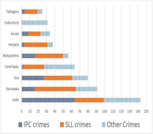
Q110CAT 2018 · Slot 1✓ Answer verified

Set 4 : LED TV Sales

The multi-layered pie-chart below shows the sales of LED television sets for a big retail electronics outlet during 2016 and 2017. The outer layer shows the monthly sales during this period, with each label showing the month followed by sales figure of that month. For some months, the sales figures are not given in the chart. The middle-layer shows quarter-wise aggregate sales figures (in some cases, aggregate quarter-wise sales numbers are not given next to the quarter). The innermost layer shows annual sales. It is known that the sales figures during the three months of the second quarter (April, May, June) of 2016 form an arithmetic progression, as do the three monthly sales figures in the fourth quarter (October, November, December)of that year.
Figure for this questionFigure for this questionFigure for this questionFigure for this question

In which quarter of 2017 was the percentage increase in sales from the same quarter of 2016 the highest?
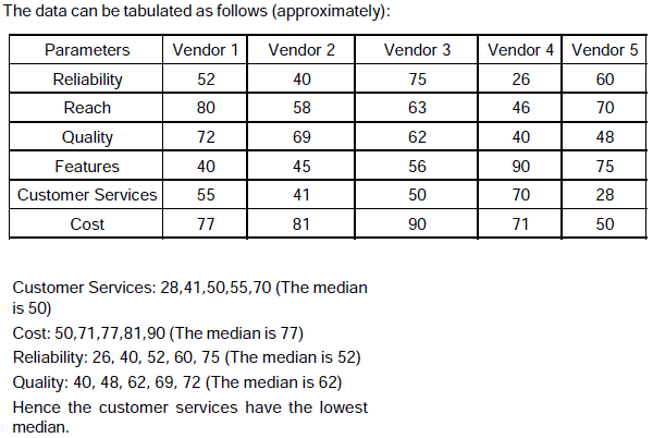
Q111CAT 2018 · Slot 1✓ Answer verified

Set 4 : LED TV Sales

The multi-layered pie-chart below shows the sales of LED television sets for a big retail electronics outlet during 2016 and 2017. The outer layer shows the monthly sales during this period, with each label showing the month followed by sales figure of that month. For some months, the sales figures are not given in the chart. The middle-layer shows quarter-wise aggregate sales figures (in some cases, aggregate quarter-wise sales numbers are not given next to the quarter). The innermost layer shows annual sales. It is known that the sales figures during the three months of the second quarter (April, May, June) of 2016 form an arithmetic progression, as do the three monthly sales figures in the fourth quarter (October, November, December)of that year.
Figure for this questionFigure for this questionFigure for this questionFigure for this question

During which quarter was the percentage decrease in sales from the previous quarter’s sales the highest?

Q112CAT 2018 · Slot 1✓ Answer verified

Set 4 : LED TV Sales

The multi-layered pie-chart below shows the sales of LED television sets for a big retail electronics outlet during 2016 and 2017. The outer layer shows the monthly sales during this period, with each label showing the month followed by sales figure of that month. For some months, the sales figures are not given in the chart. The middle-layer shows quarter-wise aggregate sales figures (in some cases, aggregate quarter-wise sales numbers are not given next to the quarter). The innermost layer shows annual sales. It is known that the sales figures during the three months of the second quarter (April, May, June) of 2016 form an arithmetic progression, as do the three monthly sales figures in the fourth quarter (October, November, December)of that year.
Figure for this questionFigure for this questionFigure for this questionFigure for this question

During which month was the percentage increase in sales from the previous month’s sales the highest?

Q113CAT 2017 · Slot 1 · TITA✓ Answer verified

Simple Happiness Index

The simple Happiness index (SHI) of a country is computed on the basis of three parameters: social support (S), freedom to life choices (F) and corruption perception (C). Each of these three parameters is measured on a scale of 0 to 8 (integers only). A country is then categorized based on the total score obtained by summing the scores of ail the three parameters, as shown in the following table: The following diagram depicts the frequency distribution of the scores in S, F and C of 10 countries − Amda, Benga, Calla, Delma, Eppa, Varsa, Wanna, Xanda, Yanga and Zooma: Further, the following are known: 1.Amda and Calla jointly have the lowest total score, 7, with identical scores in all the three parameters. 2.Zooma has a total score of 17. 3.All the 3 countries, which categorised as happy, have the highest score in exactly one parameter.
Figure for this questionFigure for this questionFigure for this questionFigure for this questionFigure for this questionFigure for this question

What is Amda's score in F? (TITA)

Q114CAT 2017 · Slot 1 · TITA✓ Answer verified

Simple Happiness Index

The simple Happiness index (SHI) of a country is computed on the basis of three parameters: social support (S), freedom to life choices (F) and corruption perception (C). Each of these three parameters is measured on a scale of 0 to 8 (integers only). A country is then categorized based on the total score obtained by summing the scores of ail the three parameters, as shown in the following table: The following diagram depicts the frequency distribution of the scores in S, F and C of 10 countries − Amda, Benga, Calla, Delma, Eppa, Varsa, Wanna, Xanda, Yanga and Zooma: Further, the following are known: 1.Amda and Calla jointly have the lowest total score, 7, with identical scores in all the three parameters. 2.Zooma has a total score of 17. 3.All the 3 countries, which categorised as happy, have the highest score in exactly one parameter.
Figure for this questionFigure for this questionFigure for this questionFigure for this questionFigure for this questionFigure for this question

What is Zooma's score in S? (TITA)

Q115CAT 2017 · Slot 1✓ Answer verified

Simple Happiness Index

The simple Happiness index (SHI) of a country is computed on the basis of three parameters: social support (S), freedom to life choices (F) and corruption perception (C). Each of these three parameters is measured on a scale of 0 to 8 (integers only). A country is then categorized based on the total score obtained by summing the scores of ail the three parameters, as shown in the following table: The following diagram depicts the frequency distribution of the scores in S, F and C of 10 countries − Amda, Benga, Calla, Delma, Eppa, Varsa, Wanna, Xanda, Yanga and Zooma: Further, the following are known: 1.Amda and Calla jointly have the lowest total score, 7, with identical scores in all the three parameters. 2.Zooma has a total score of 17. 3.All the 3 countries, which categorised as happy, have the highest score in exactly one parameter.
Figure for this questionFigure for this questionFigure for this questionFigure for this questionFigure for this questionFigure for this question

Benga and Delma, two countries categorized as happy, are tied with the same total score. What is the maximum score they can have?

Q116CAT 2017 · Slot 1✓ Answer verified

Simple Happiness Index

The simple Happiness index (SHI) of a country is computed on the basis of three parameters: social support (S), freedom to life choices (F) and corruption perception (C). Each of these three parameters is measured on a scale of 0 to 8 (integers only). A country is then categorized based on the total score obtained by summing the scores of ail the three parameters, as shown in the following table: The following diagram depicts the frequency distribution of the scores in S, F and C of 10 countries − Amda, Benga, Calla, Delma, Eppa, Varsa, Wanna, Xanda, Yanga and Zooma: Further, the following are known: 1.Amda and Calla jointly have the lowest total score, 7, with identical scores in all the three parameters. 2.Zooma has a total score of 17. 3.All the 3 countries, which categorised as happy, have the highest score in exactly one parameter.
Figure for this questionFigure for this questionFigure for this questionFigure for this questionFigure for this questionFigure for this question

If Benga scores 16 and Delma scores 15, then what is the maximum number of countries with a score of 13?

0/116 tried · 0 right

Every question here appeared in an actual CAT paper. For the full paper, open its page from the question's year and slot, or browse another topic from the list. Also on IIMking.com.